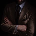
Insights: Wearing a Light Coloured Tie
The traditional rig is darker jacket, light shirt, darker tie. Balanced contrast, with some visual separation between each of the items of clothing. The idea behind this post is to explore different combinations that center around a light coloured tie. I see a few options:
- Dark sport coat, light shirt
- Dark sport coat, dark shirt
- Medium sport coat, light shirt
- Medium sport coat, dark shirt
- Light sport coat, light shirt
- Light sport coat, dark shirt
Just to be clear, I think there are a couple combinations in that list that will be extremely difficult to pull off. Specifically: dark sport coat, dark shirt and light sport coat, dark shirt. I’ve limited my variables to the upper block of the outfit, but for each one the trouser choice will be important to how successful the overall look is.
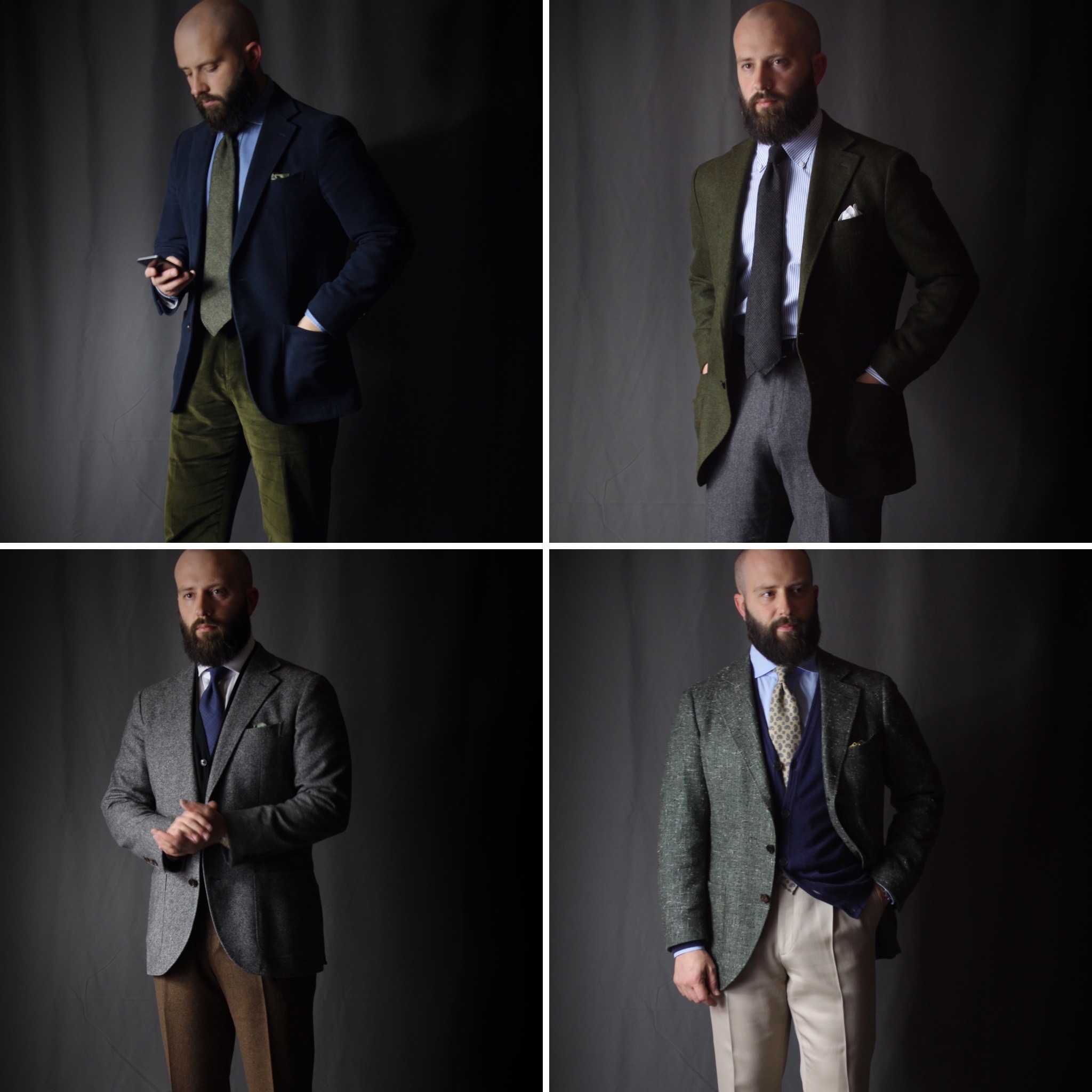
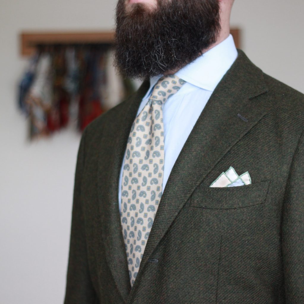
Dark sport coat, light shirt
This one can be hit or miss. A coherent outfit will have some reliance on a balanced measure of contrast, and a light shirt and light tie may not provide that.
This outfit worked rather well. The tie is from Cavour, and is a very unique pattern that has a light colour scheme. Cream base with light blue and light green paisleys and square repeating. In this case, the camel flannel trousers maintain the lighter tones through to the bottom half. This allows the jacket to be the standout piece in the outfit. My Rickshaw Cart pocket square from Kent Wang compliments the lighter colours throughout.
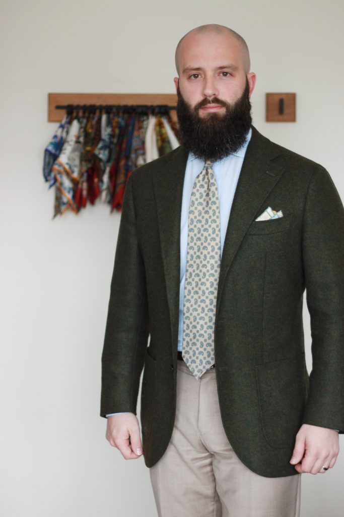
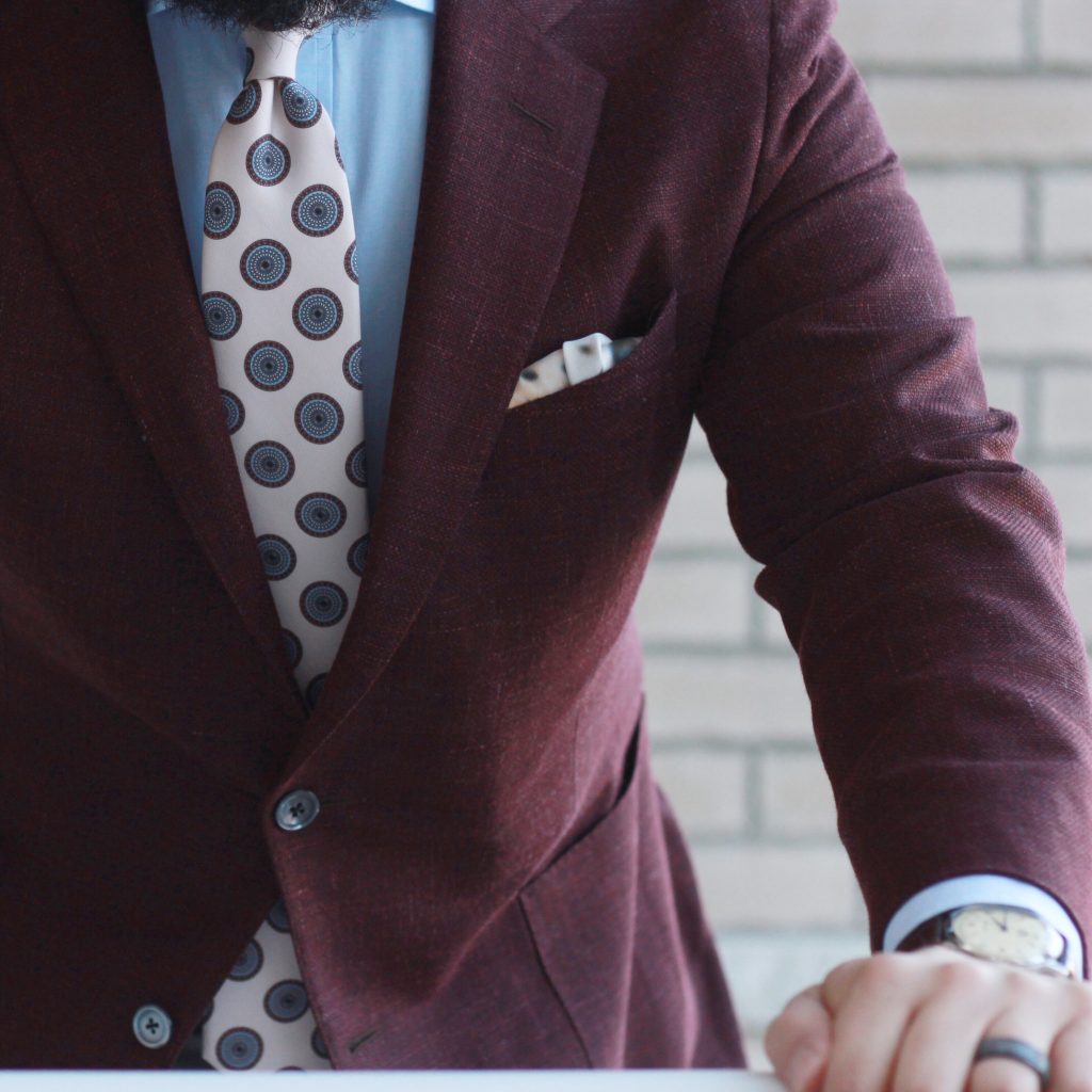
Dark sport coat, dark shirt
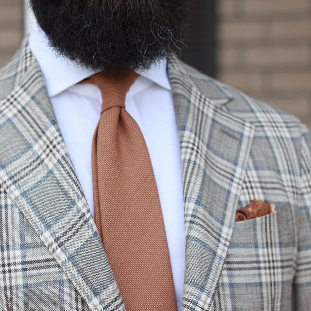
Ok, so I might have to stretch the definition of dark shirt to include shirts that are more saturated than they are dark. I don’t own any truly dark dress shirts – think navy or black – as they wouldn’t see much use. Here’s an example with my Donegal sport coat, a chambray shirt, light coloured tie, and navy trousers for bonus points. The tie is a lovely light brown herringbone from Oxford Rowe (review coming soon!).
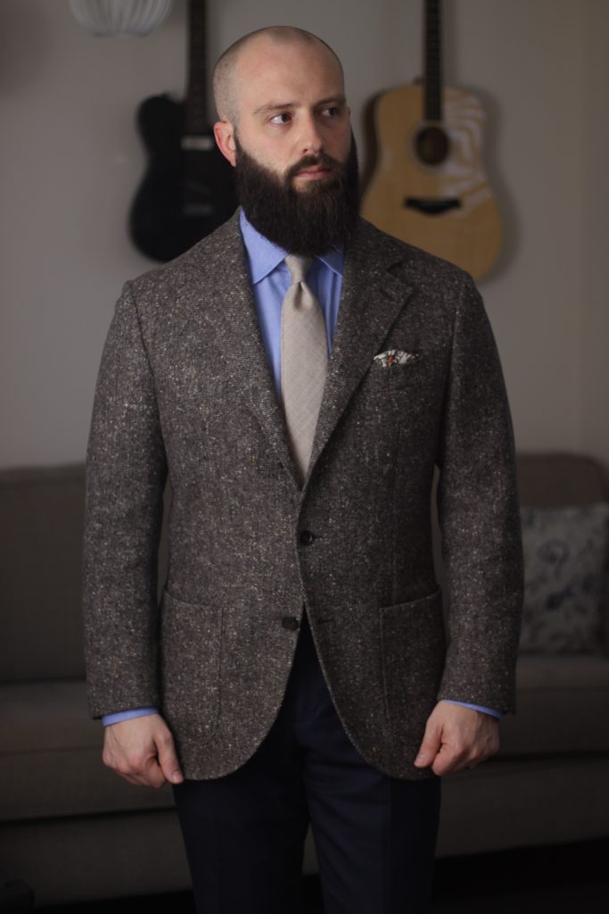
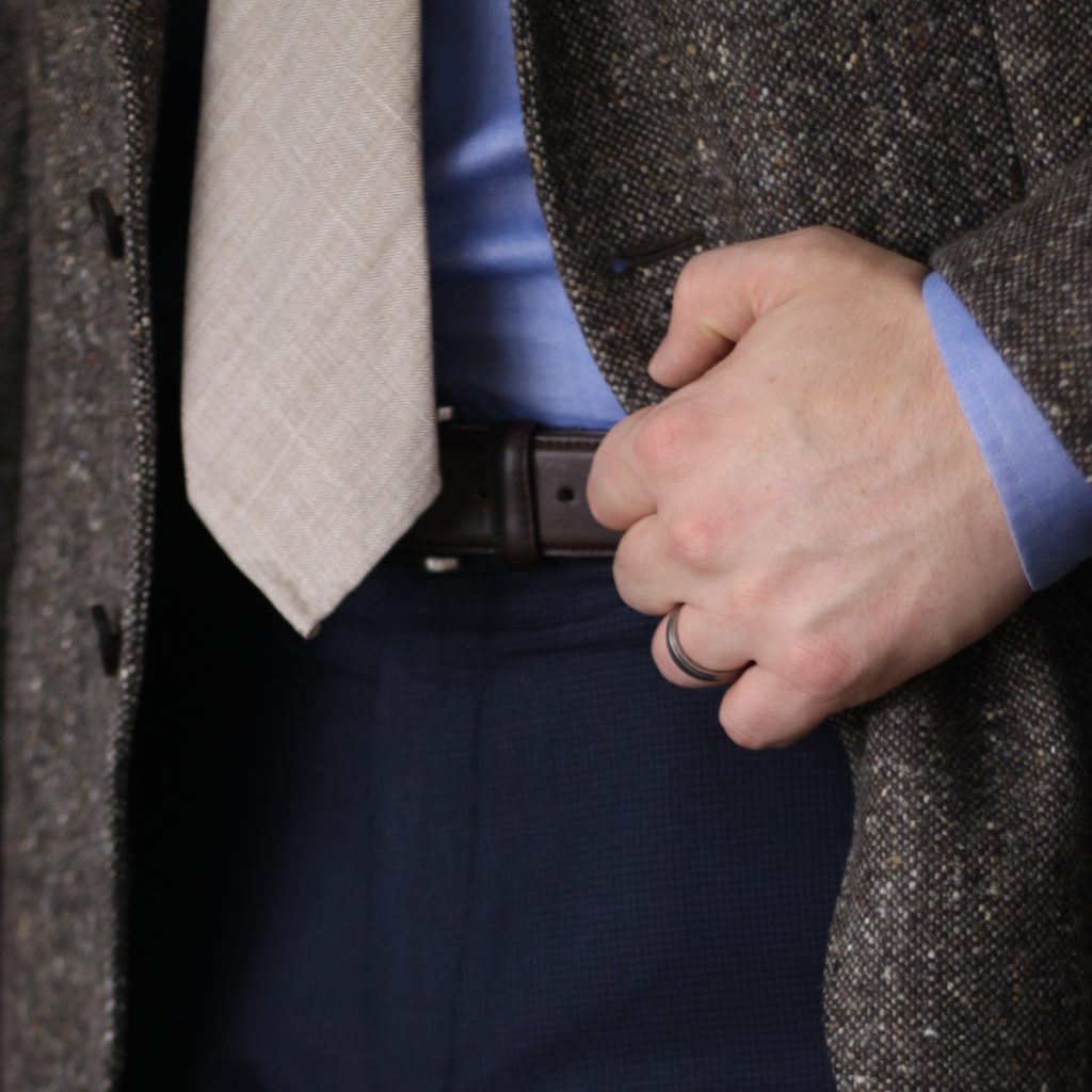
This look might not be for everyone, but I think it was successful. The blue shirt and navy trousers add a cool element to the outfit, which is balanced by the neutral tie and jacket. Overall, the use of contrast provides interest because it isn’t the usual application. Let me clarify – the tie and jacket have contrast, but the tie and shirt don’t. The jacket and trousers have some contrast, but the contrast is highest between the trousers and tie. I think it was an outfit that requires a second look to appreciate how everything comes together.
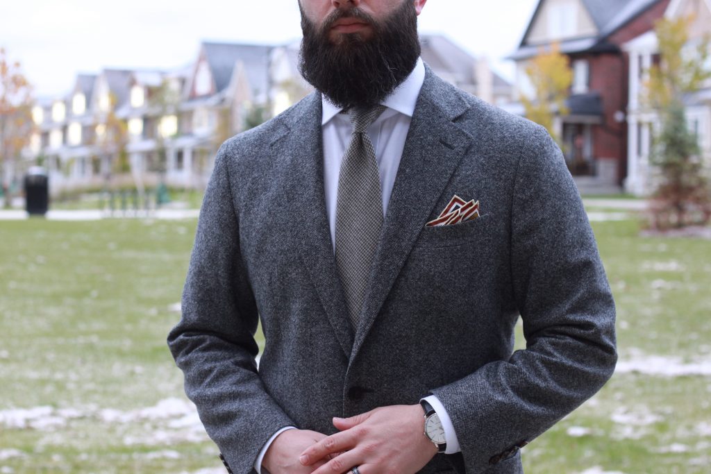
Medium sport coat, light shirt
Less contrast between the jacket and tie compared to the last couple of fits. This grey merino tweed sport coat is pretty middle of the road – not light grey, but not charcoal either. The real point of contrast is the burgundy trousers and the pocket square from Rampley & Co. They also stand out as the only pieces with any colour. Looking to maximize what little contrast was available in the top block, I chose a white dress shirt.
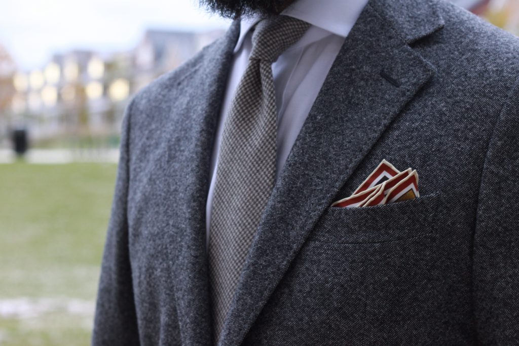
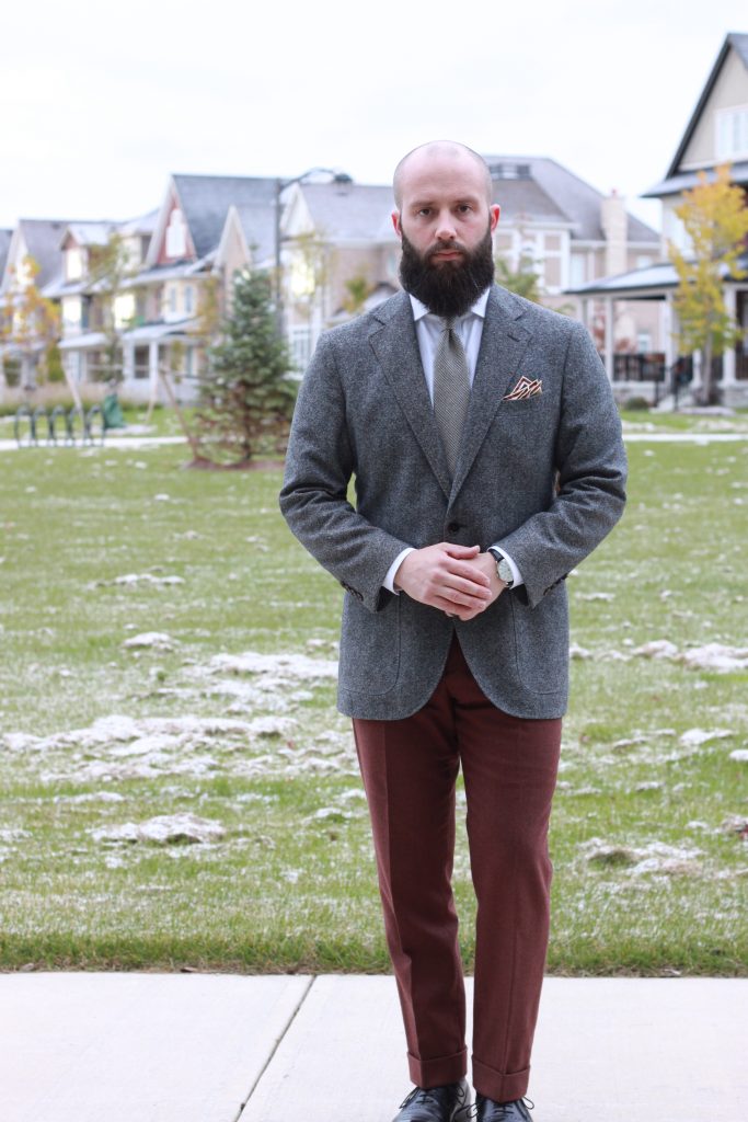
I did like this outfit, though it looks a bit like two halves from different outfits – top half and bottom half – combined. I do like the burgundy and grey together, but might chose a tie with a little colour next time.
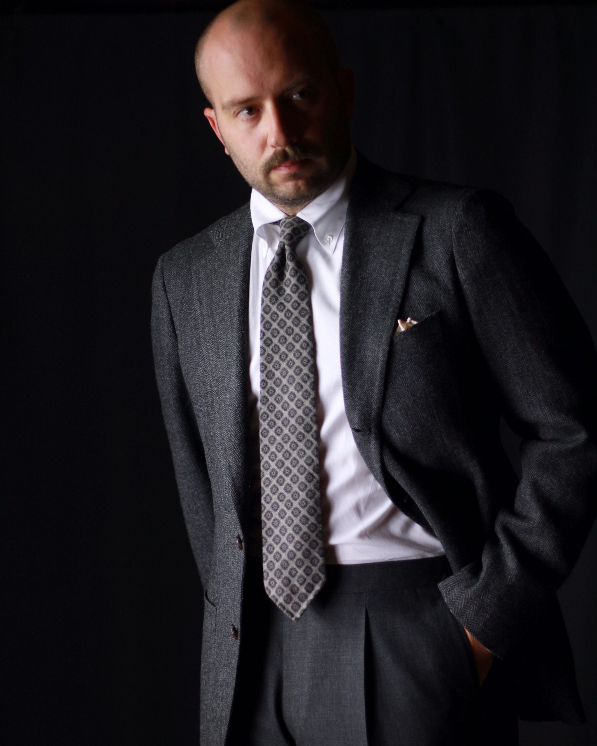
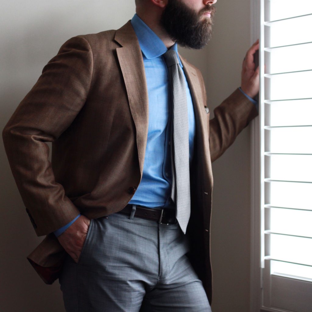
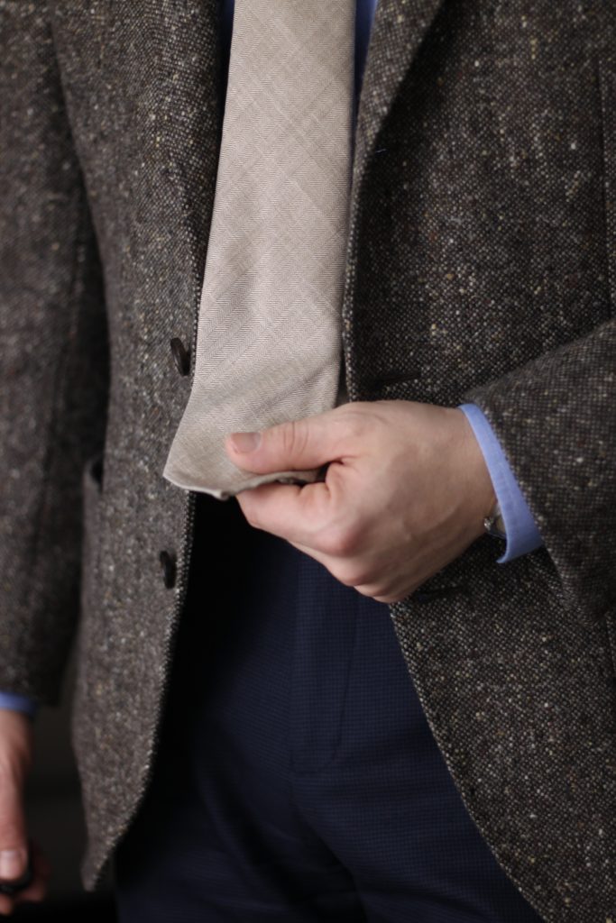
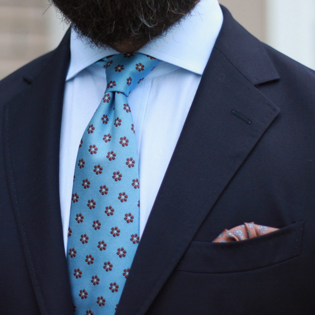
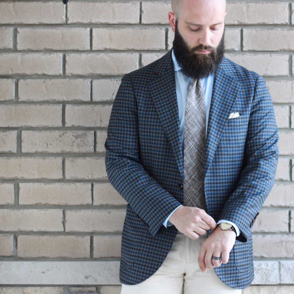
Medium sport coat, dark shirt
Defining the different pieces in my wardrobe to fit into light, medium and dark is a bit of an arbitrary exercise. I feel like some may move one space adjacent, depending on the context of the shirt, tie and trousers.
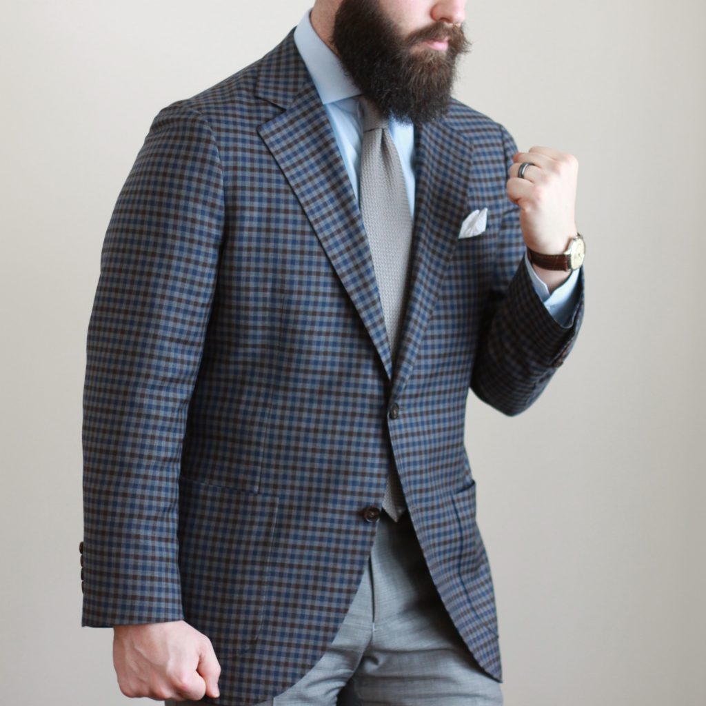
That being said, this one is a bit of a stretch to call the shirt dark. It is a fairly saturated blue, so I’ll keep going with the analysis. Light grey trousers, blue royal twill shirt and my silver grenadine from Kent Wang. As light as the tie is, the overall effect is that nothing has more or less contrast to the other pieces in the combination. I like how everything pairs, but nothing is a standout piece. The white pocket square is the lone bit of brightness in an otherwise “medium” outfit.
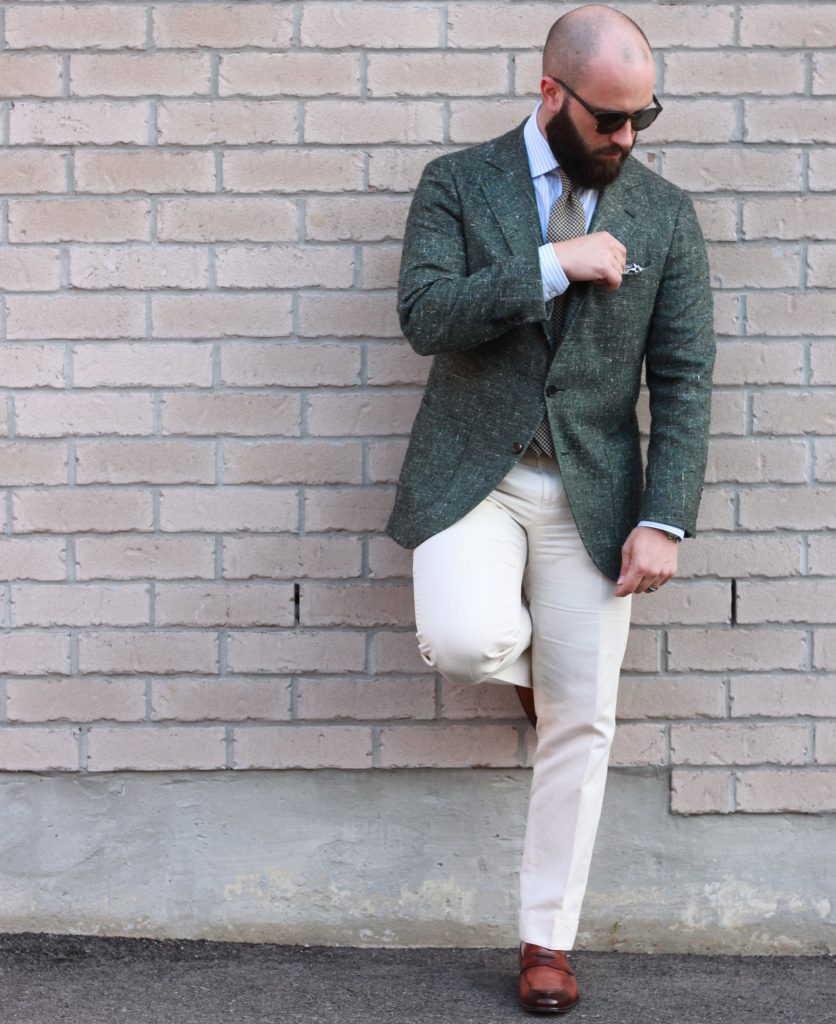
Light sport coat, light shirt
I do enjoy having a few light coloured sport coats in my collection. They are all Spring/Summer weight, and I’ve been missing them through the cold weather.
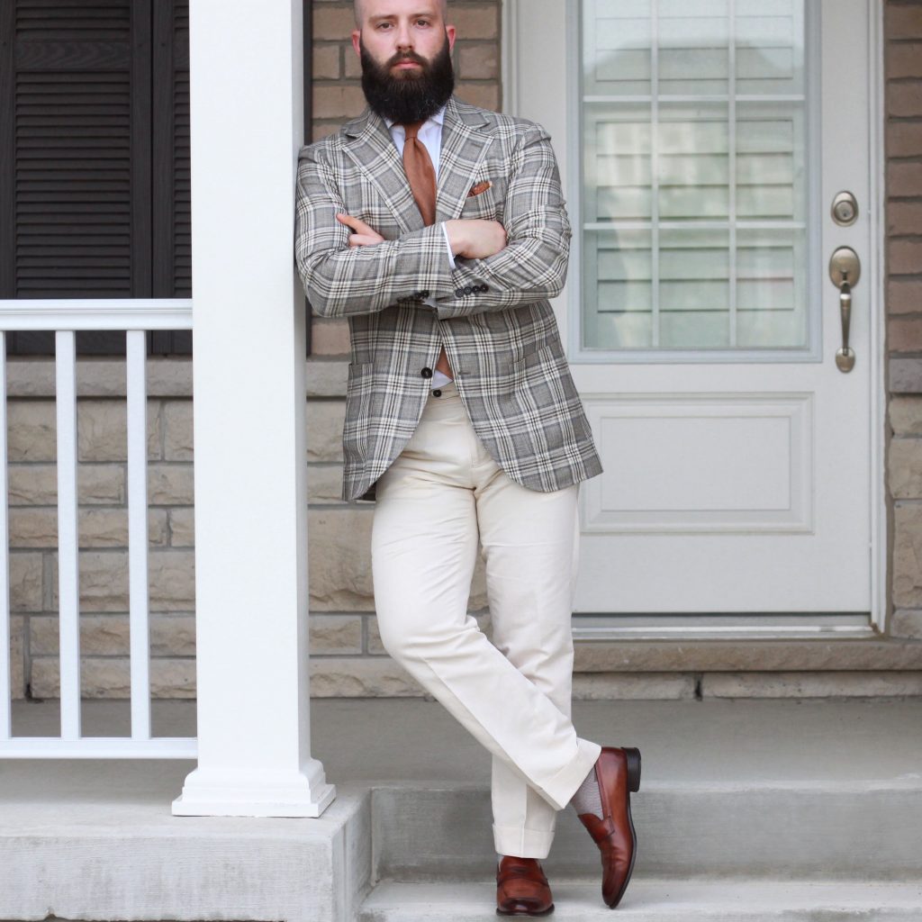
This is another outfit where the trouser choice was critical to the success. These are my cream cotton/linen trousers, a wonderful fabric from Sondrio made up by Spier & Mackay. Side tabs, and nice, robust 2″ cuffs. The tie is an old favourite – granola coloured hopsack from Vanda. The pocket square is a limited edition Master Shoemakers x Vanda collaboration – and are the darkest pieces in the outfit. A perfect example of the context I was referring to – I would define this tie as a light one, but here it does a good job of carrying visual weight.
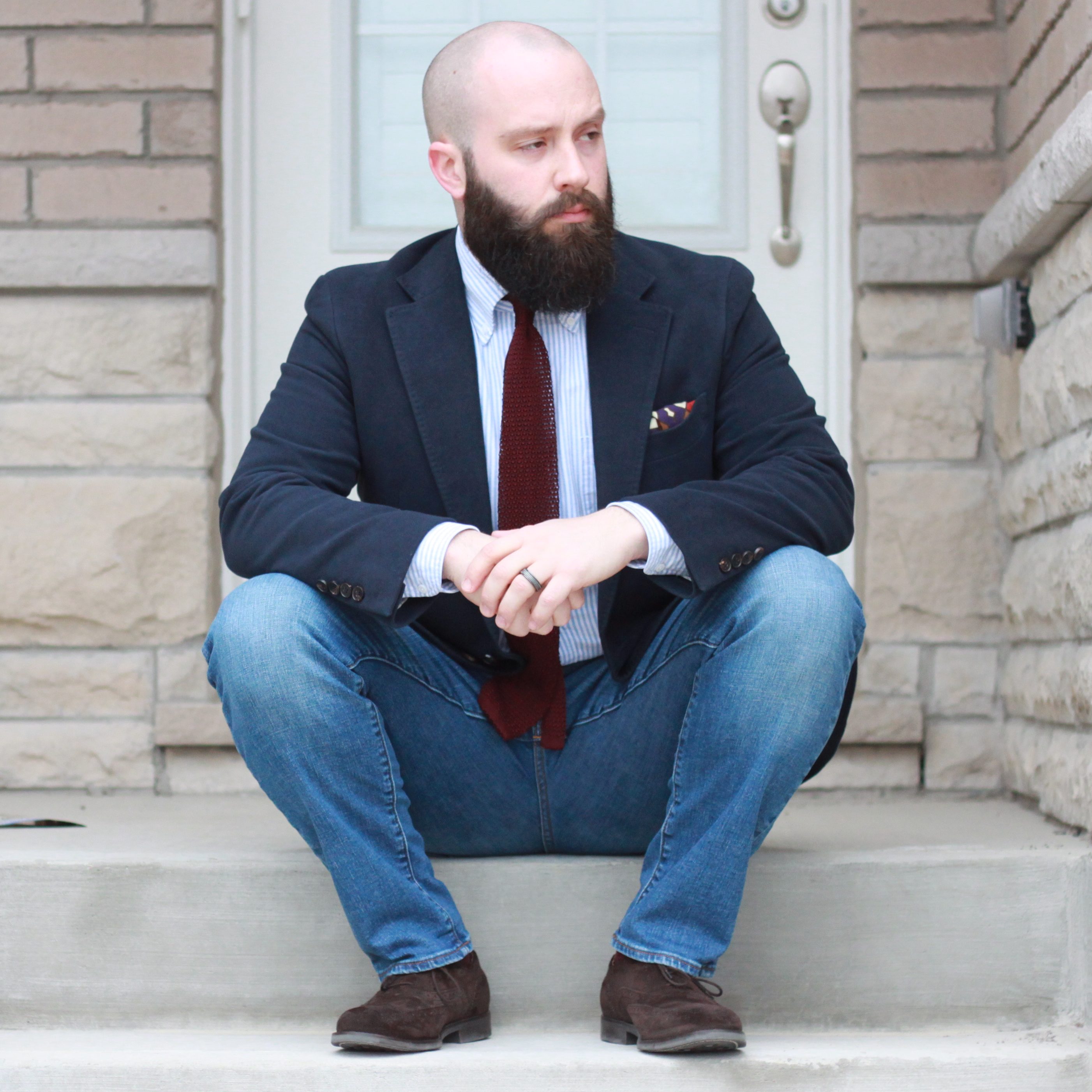
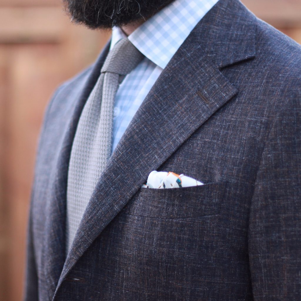
Light sport coat, dark shirt
My darkest dress shirts are my chambray and denim – neither are particularly dark, but both are quite saturated. This outfit includes my tan herringbone sport coat, chambray shirt, and silver grenadine tie.
Dramatic lighting really helps with the contrast – adding highlights and shadows that add depth that might not otherwise show through. I think this outfit worked well, though objectively the shirt probably needs to be either lighter or darker.
Light ties
I think light ties have their place, but contrast that might get taken for granted in other outfits becomes critical. Some contrast will be inherent based on the colours used in the outfit, but with lighter ties the saturation can’t be counted on. What do you think about light ties? How would you wear them?
I’d love to hear your thoughts. Drop me a comment down below!
-Colin