Inspiration: One pocket square, four ways – Kent Wang Rickshaw Cart
Hip to be square
This was a fun activity I’ve done on Instagram a couple of times. One pocket square – four ways. Get it? Squares have four sides. Man, I’m clever. I thought it would be good to do here since I can get into a little more detail on why I like a pocket square in each context. It may also help illustrate why (or why not) a pocket square is a versatile choice. So, first up is the…
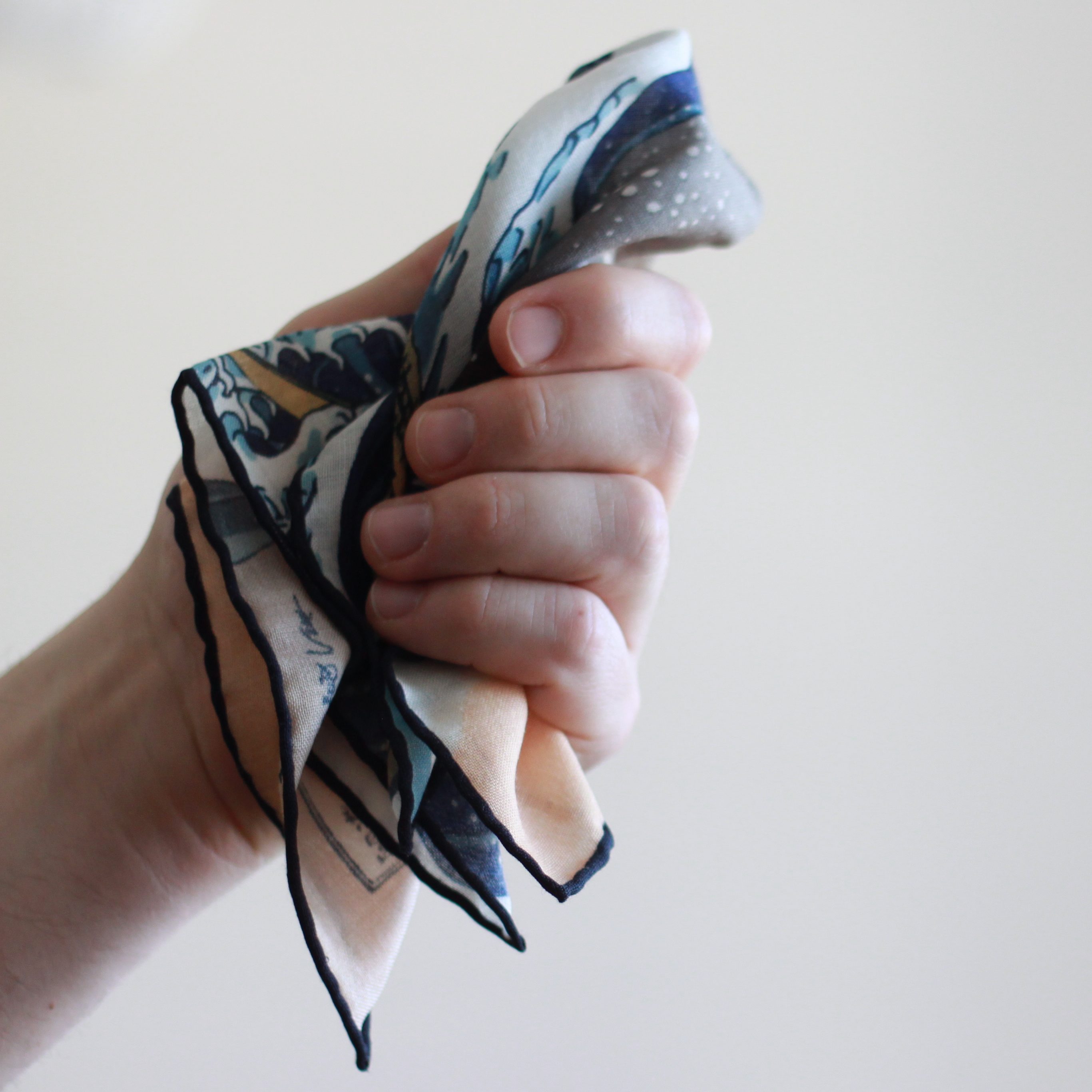
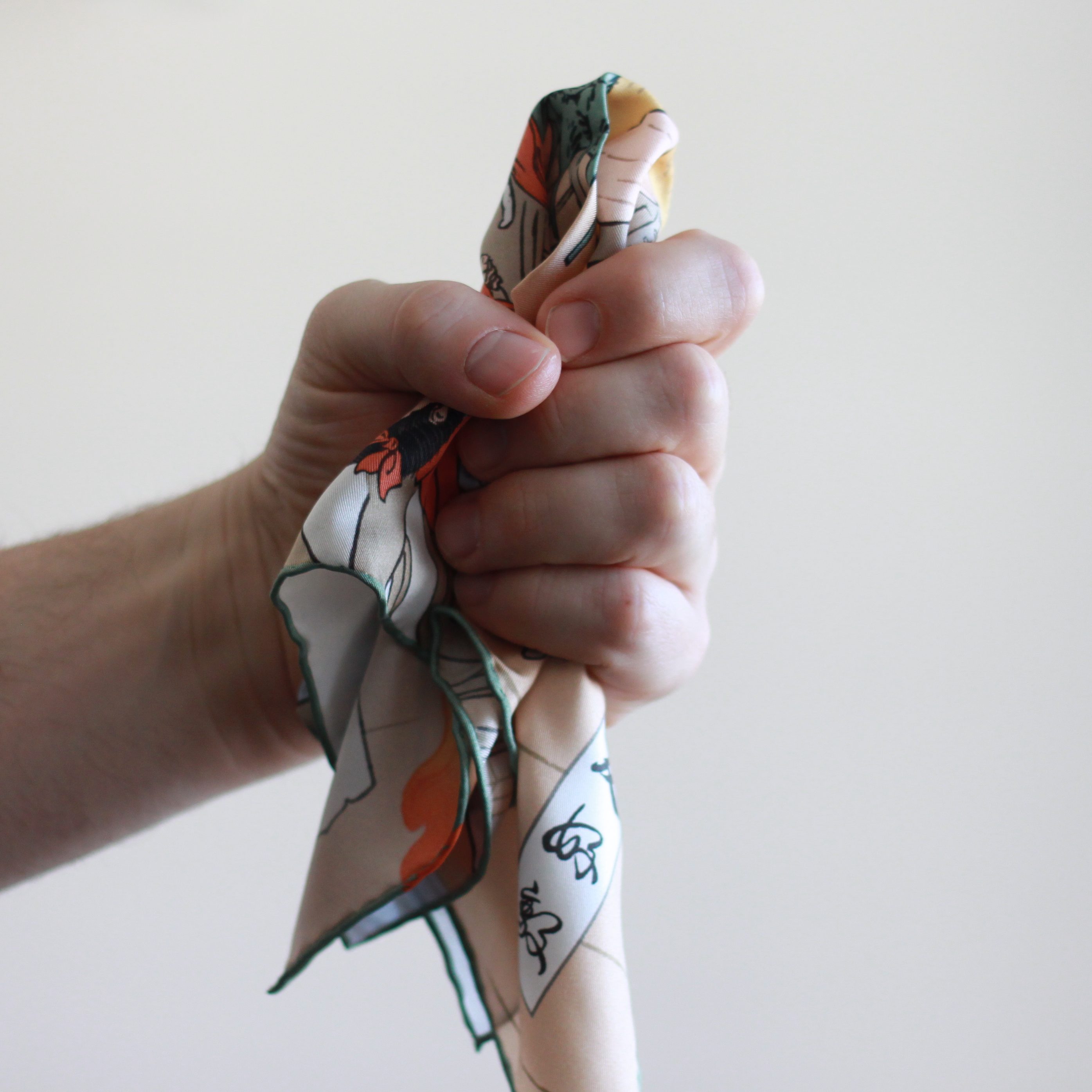
To be honest, I bought this pocket square without giving much thought to how versatile it would be. I mean, come on. It’s a Japanese-style picture of Mario chasing Bowser. My childhood love of Mario colliding with the world of menswear – how was I to resist? It looks like Kent Wang is offering some new options for this square – namely a larger size (17″ vs 13″, as well as a wool/silk blend). If you go with the silk option, you may consider sizing up to the large. Their wool/silk blends are awesome, and now that I see it’s available, I may need to order myself that version too.
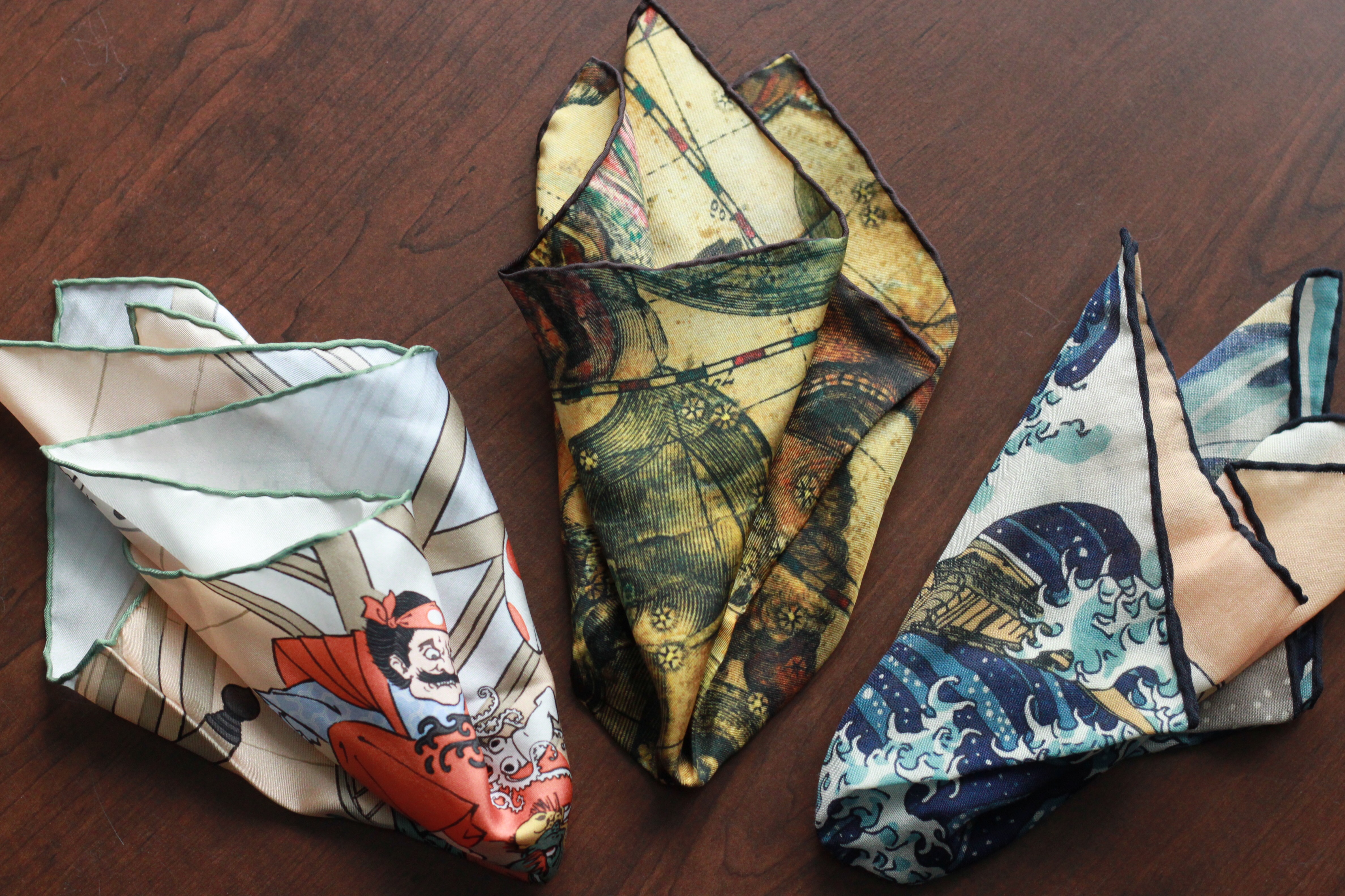
Here’s my lookbook:
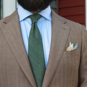
#1 - Tan sport coat, green tie
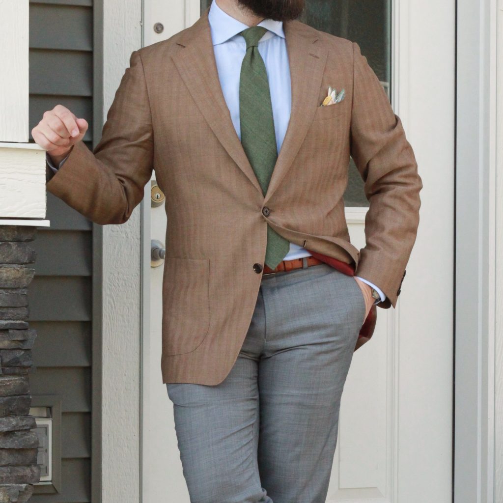
In this outfit, we start with a light brown herringbone jacket, light blue shirt and a chive green matka tie. I selected this square because the colour scheme of beige, yellow, green, and blue complimented and tied other pieces in the outfit together. I folded the square with corners up to leverage the green handrolled edges in a shade close to, but not exactly matching the tie. The warm beige and yellow showing in the puffed part tied in tonally with the jacket, while simultaneously highlighting the green and accenting the blue in the shirt. I like that the silk texture of the pocket square counterbalances the rough look of the matka tie, and the shirt and jacket have textures that sit midway between them in the texture spectrum on the outfit.
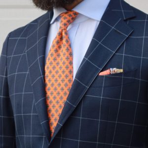
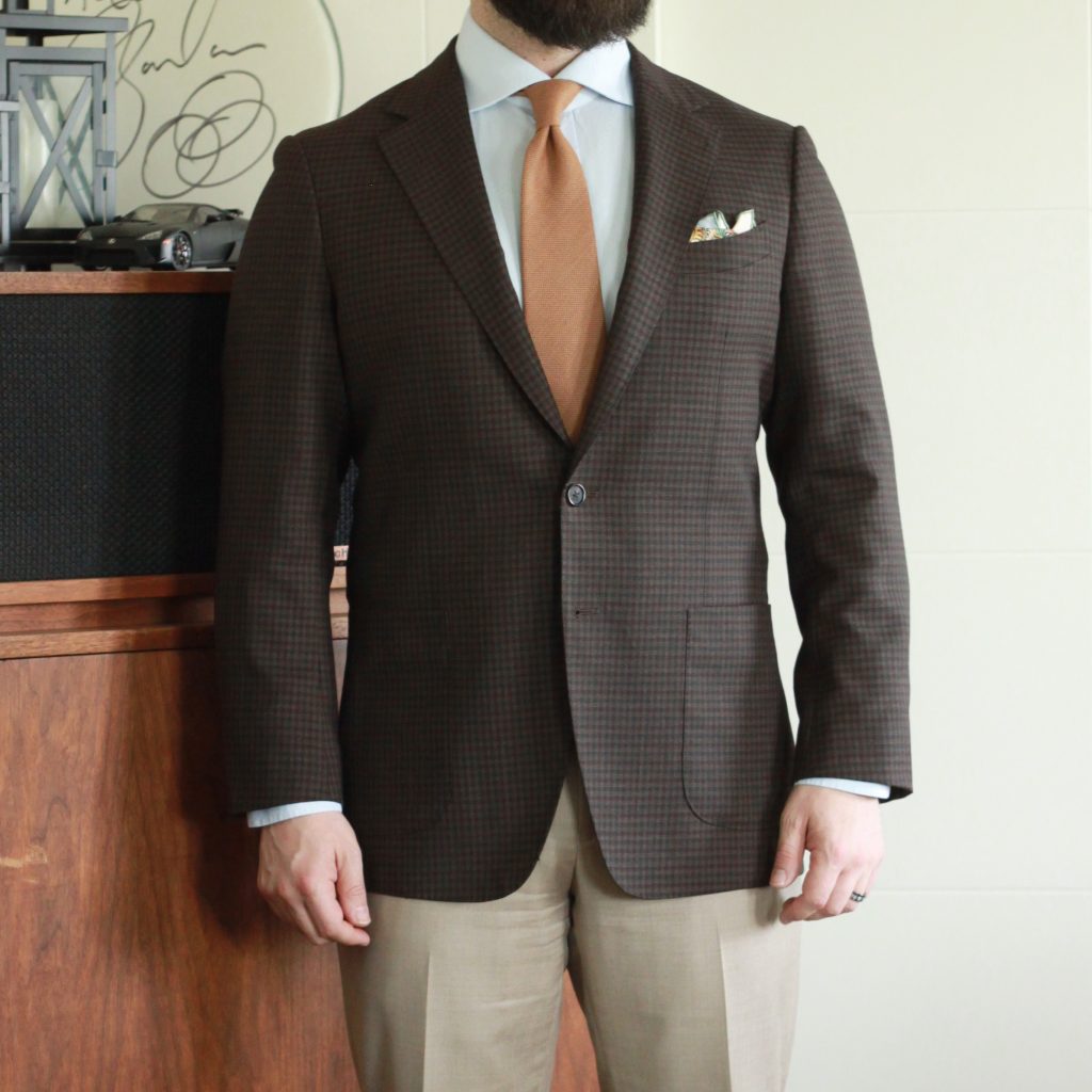
#2 - blue windowpane, orange tie
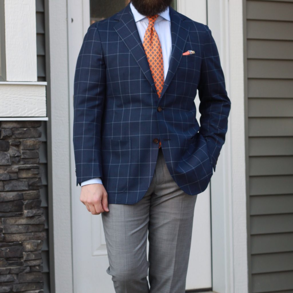
Pairing a pocket square with this tie is a bit of a challenge; the base is a bright orange and the flower-looking medallions have fuchsia, yellow and light blue. The jacket is a blue windowpane that is just a few shades lighter than navy, and I selected a very pale blue end-on-end shirt. I like the square in this context, in a rolled puff fold, as it compliments the oranges and blues without matching the shades and saturation of the colours in the tie exactly.
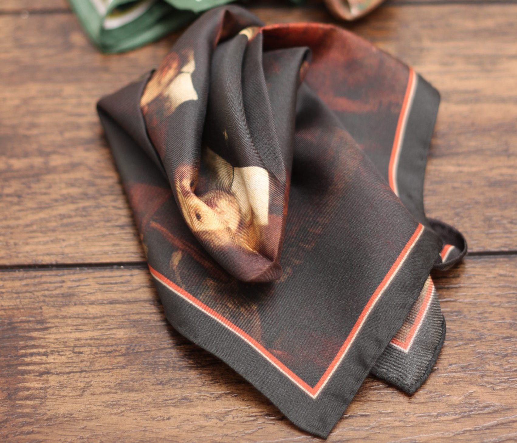
#3 blue suit, brown tie
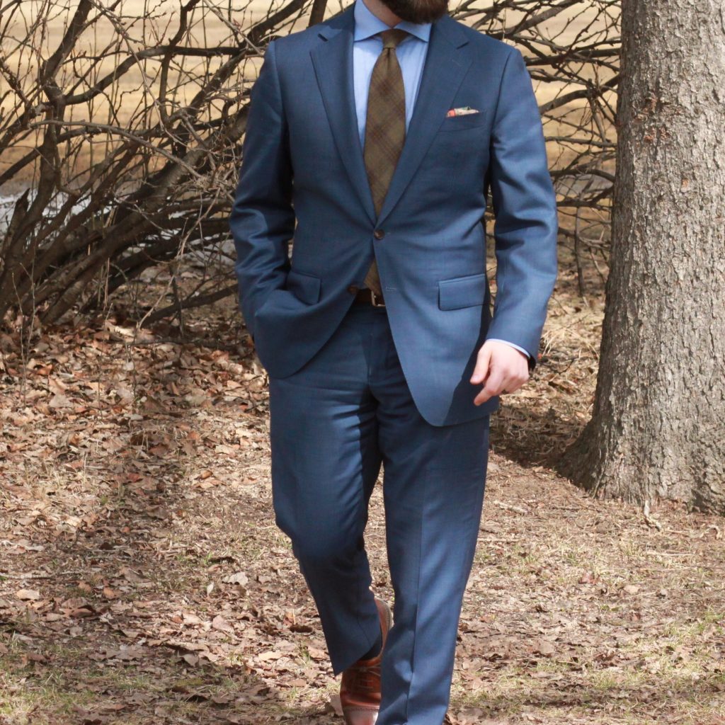
This outfit the square and shirt are a very smooth (shirt is a dress chambray), where the suit is a textured hopsack like weave and the tie is thick wool. I like that the beige, brown and orange in the tie compliments, but doesn’t match, the mossy brown and green in the tie. I also like that they are on opposite ends of the texture spectrum. Now, as much as there were things I liked about this outfit, I’m not entirely sold on the pocket square here. I think it was ok, but maybe not optimal.
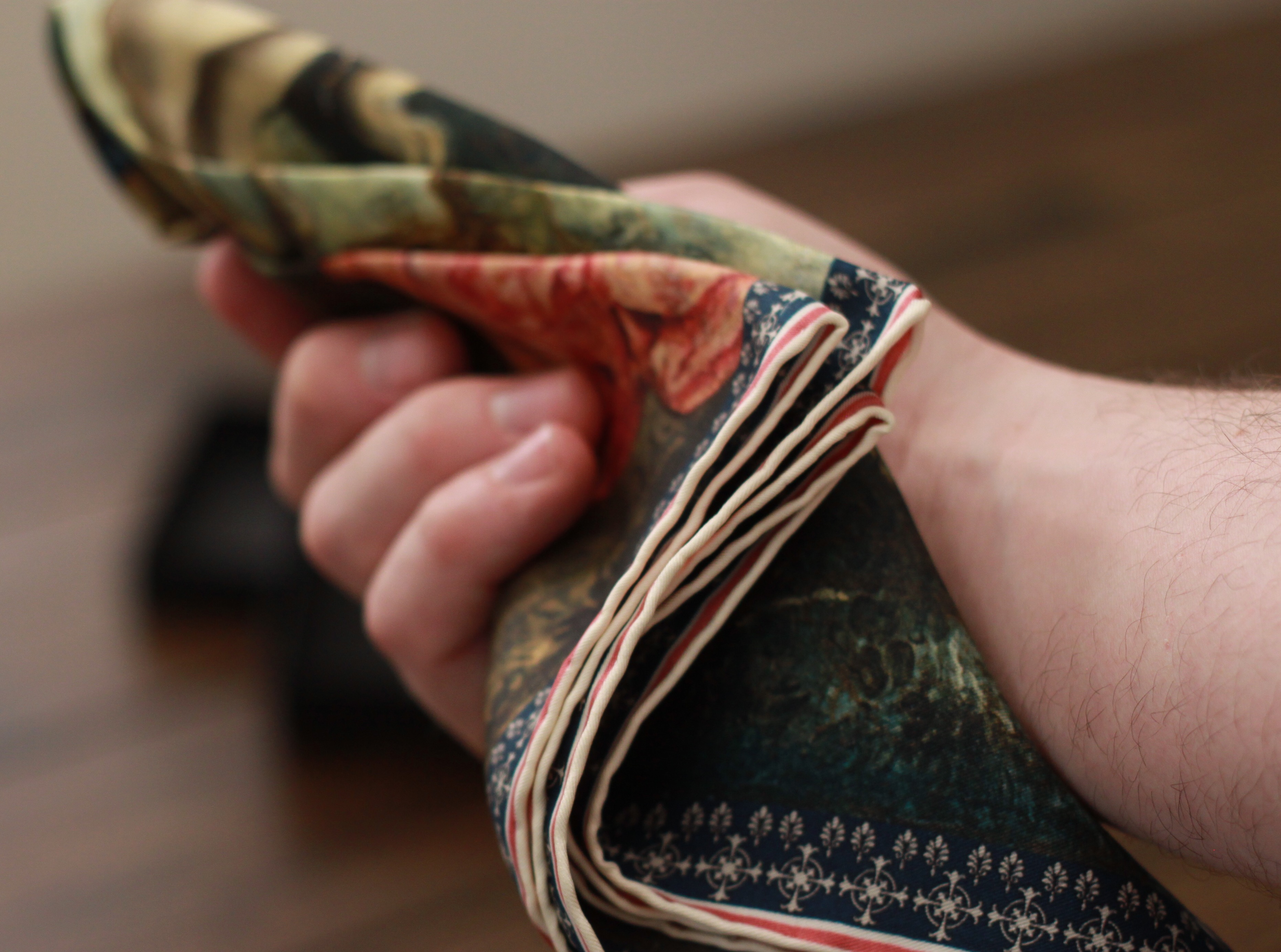
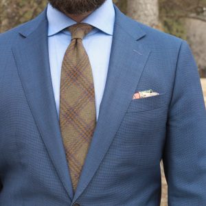
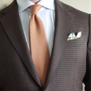
#4 - brown sport coat, granola tie
In this last outfit, I decided to use the beige and oranges in the square to pair with this “granola” coloured hopsack tie. Since those were to be the base colours, I went with this brown checked jacket and a light blue striped shirt. The jacket was to serve as the focal point being much darker and higher contrast to all the other elements. Again, the smooth silk of the square isn’t out of place with the worsted jacket, smooth shirt and hopsack tie. The green in the pocket square that shows in how I folded it is maybe a bit out of place with regards to the rest of the colours, but because I felt that the base colours in the square play so well with everything else, I was ok with the overall look.
How would you wear this pocket square? Let me know in the comments!
-Colin