What I Wore: May 2019
I’m ready to fully commit to warm weather fabrics at this point. I’ve got my eye on some new fabrics for this season, including 100% Irish linen, linen blends and fresco. More to come on those in the coming months, but for now, here’s what I wore in May.
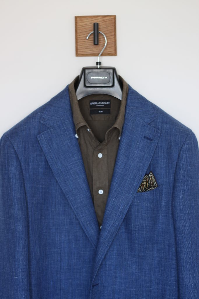
What I Wore – Blue and Olive
This outfit features a couple of recent additions: this bright blue Botolli linen blend sport coat from Spier & Mackay, along with their new olive linen button-down shirt.
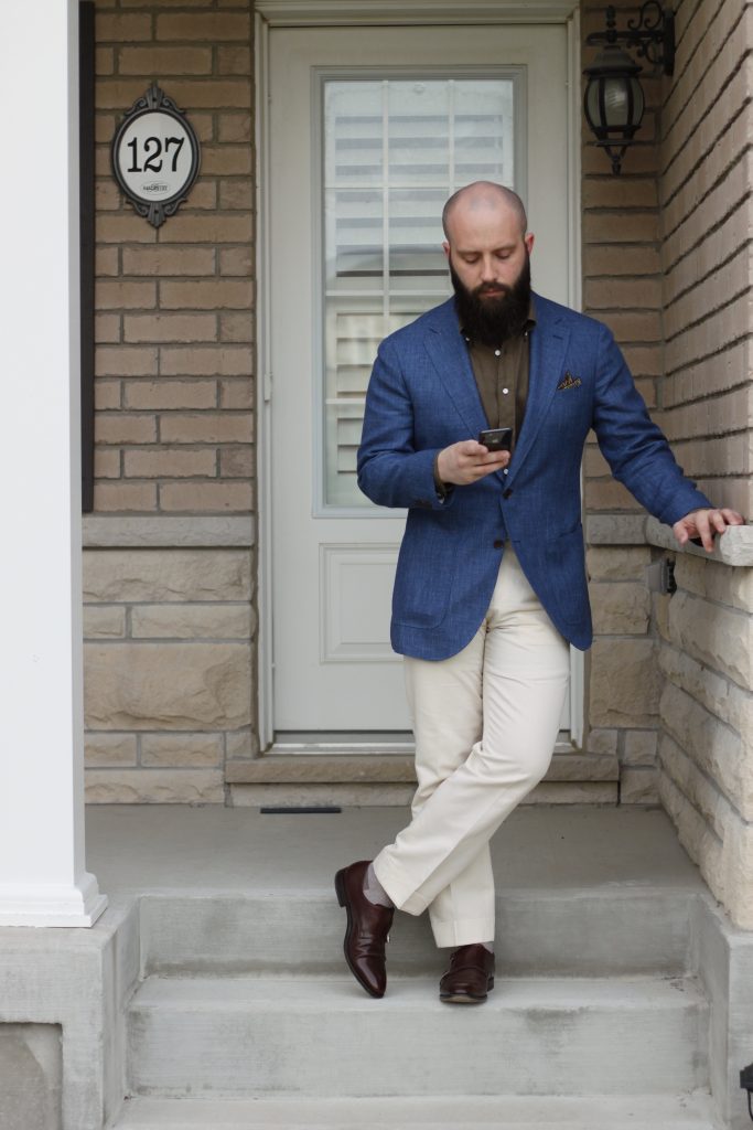
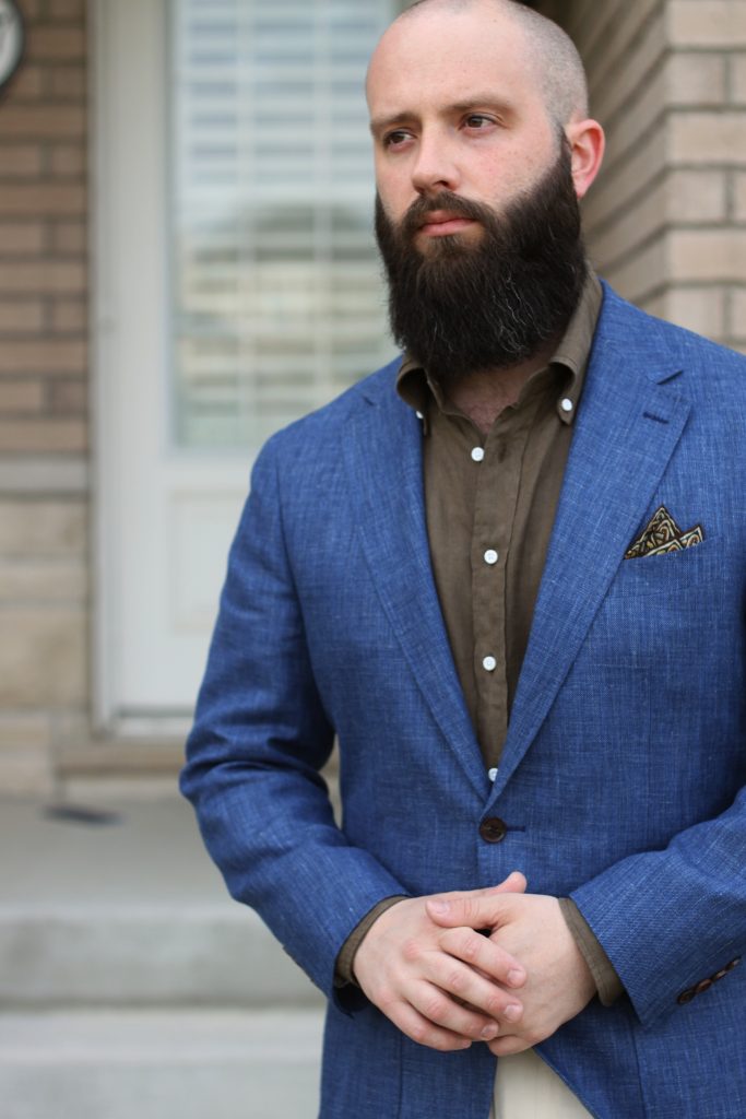
Boy, my beard was getting really long at this point. It almost deserves a “what I wore” post of its own at this point… Anyways, the rest of the outfit is comprised of my cream cotton-linen Sondrio trousers from last year, my Lod Mosaic pocket square from Kent Wang, and my chocolate double monks from 51 label. The bright blue of the jacket pairs really nicely with the dark, matte olive tone of the shirt. The cream trousers add some more contrast by pairing with the darker shoes. The Lod Mosaic square has browns, greys and olive tones, which adds some visual interest without introducing much contrast in the upper half.
I really liked this outfit, and will be playing with this colour palette again.
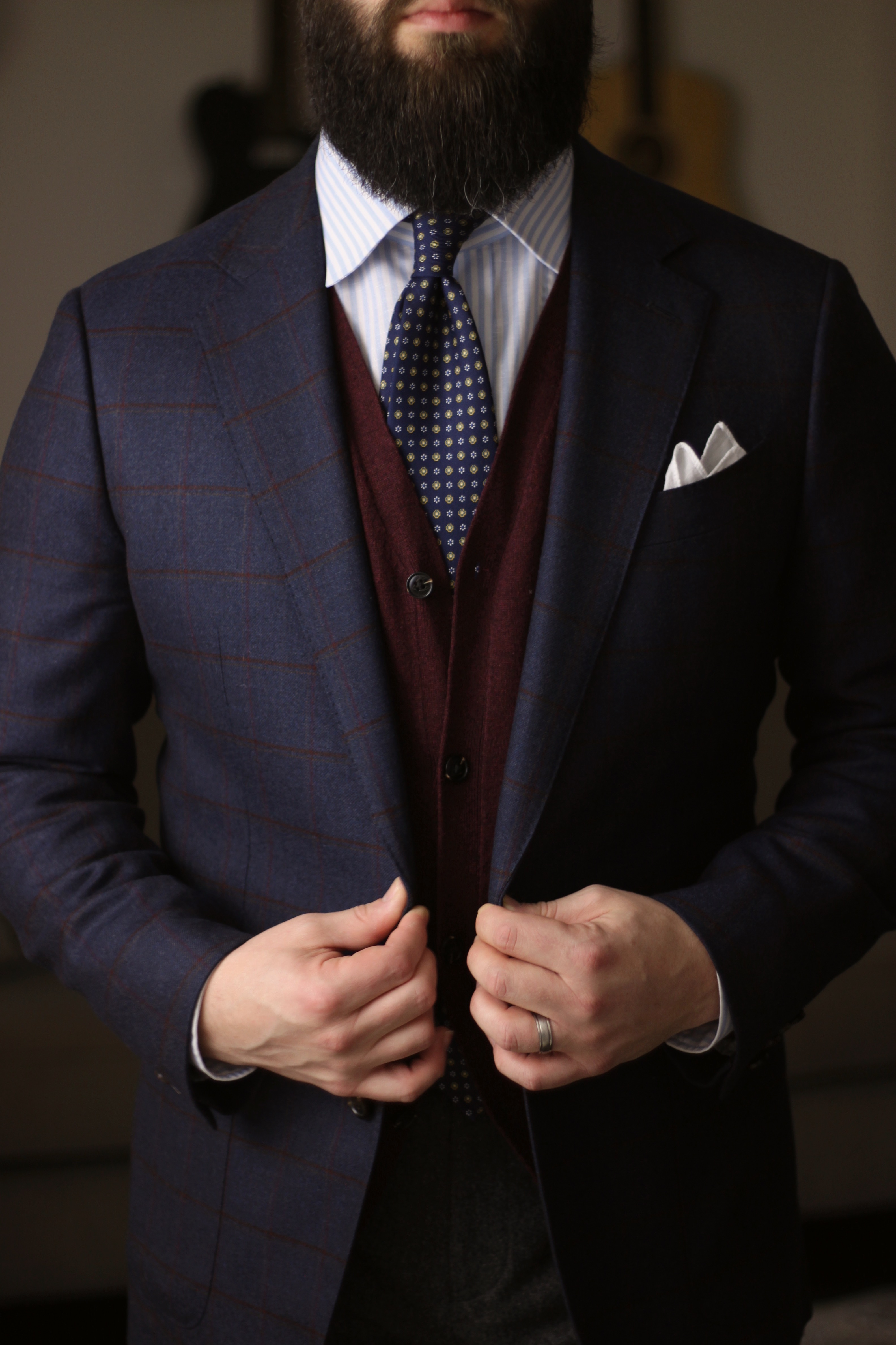
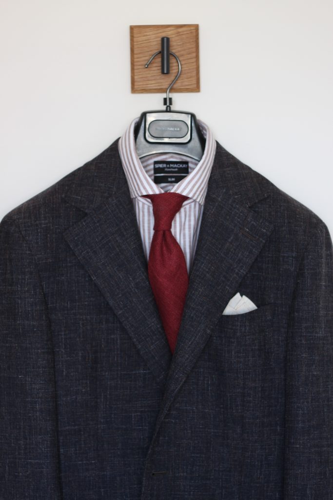
What I Wore – Brown and Red
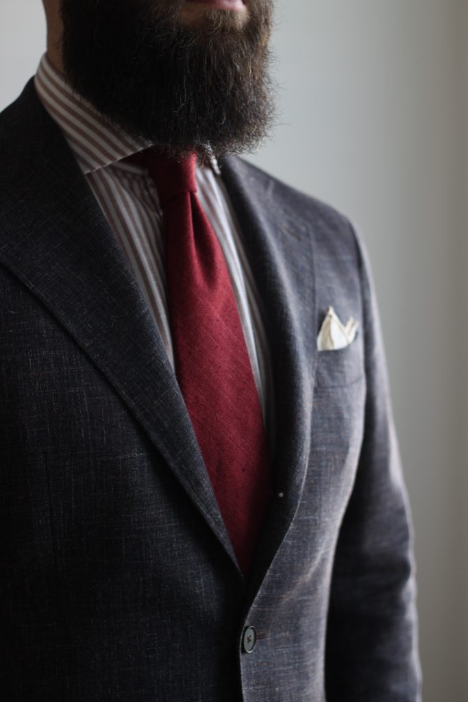
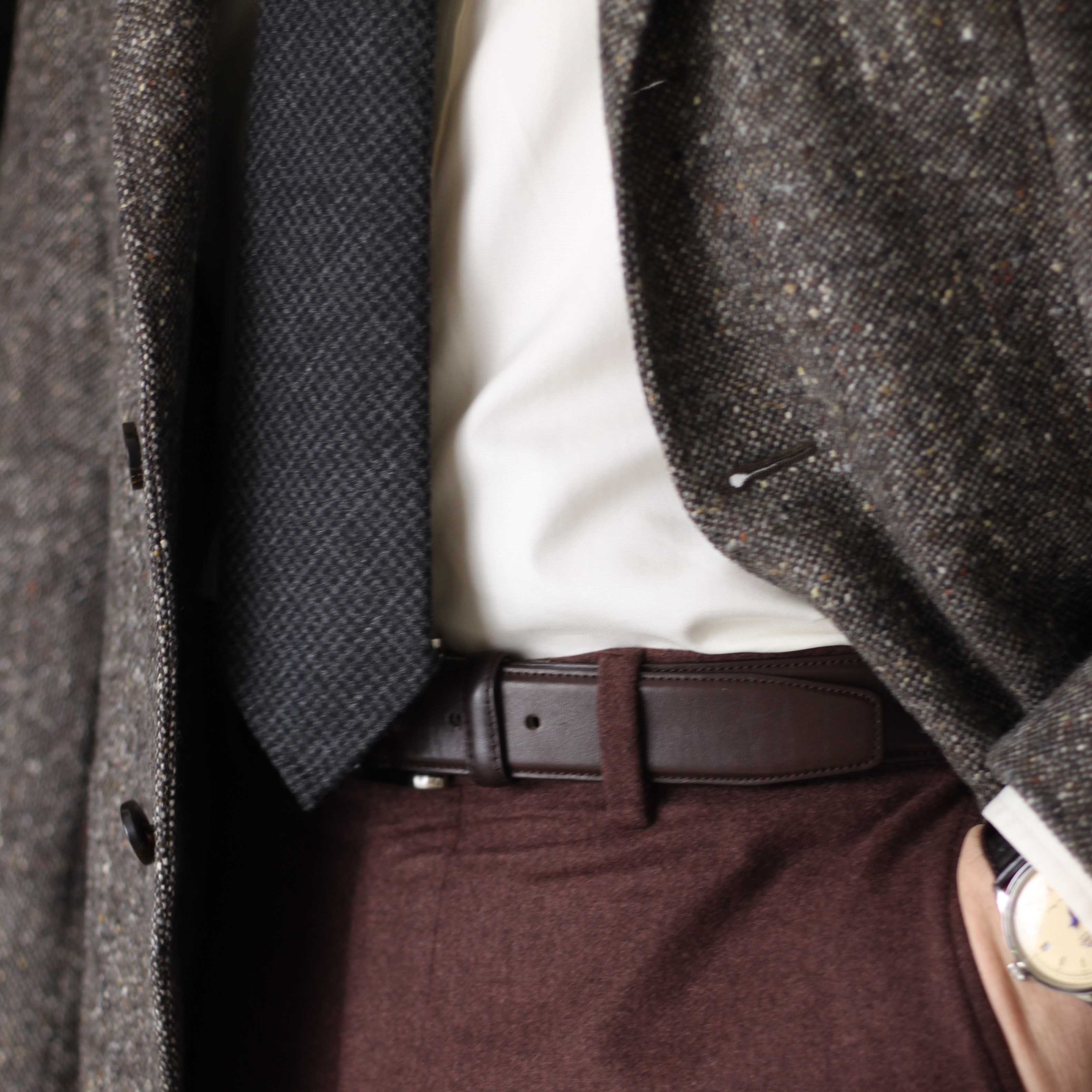
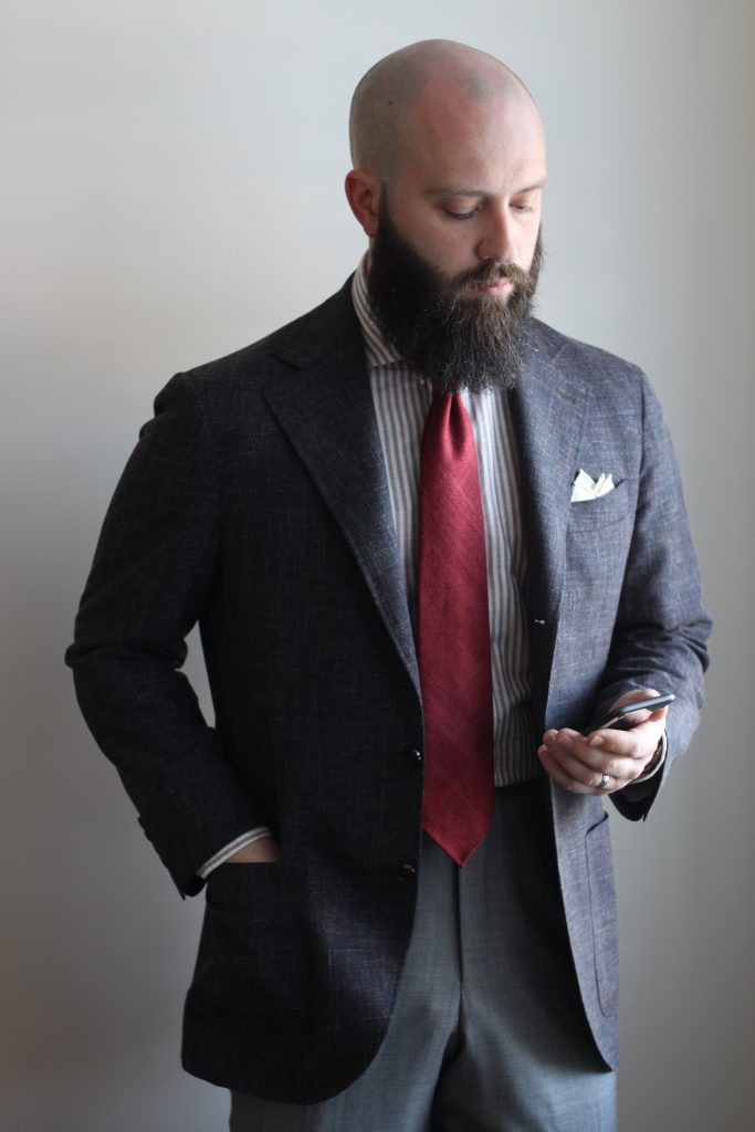
The fabric on this jacket has some great texture and colour-play. A dark grey-ish/brown base with some light grey and copper threads tossed throughout. Here, I paired with one of Spier & Mackay’s new cotton-linen shirts – this is the light brown stripe. I find that brown and red can work really well together, and since I don’t often find an outfit that can support and balance this tie, I tried out my rhubarb matka from Vanda. To stay in the same tonal family of the shirt, I went with my cream waves square (also from Vanda). Below are my first pair of MTM trousers from Spier & Mackay. Tim Hanchett (@induere_to)at the downtown Toronto location. I’m working on putting some thoughts together about them for another post.
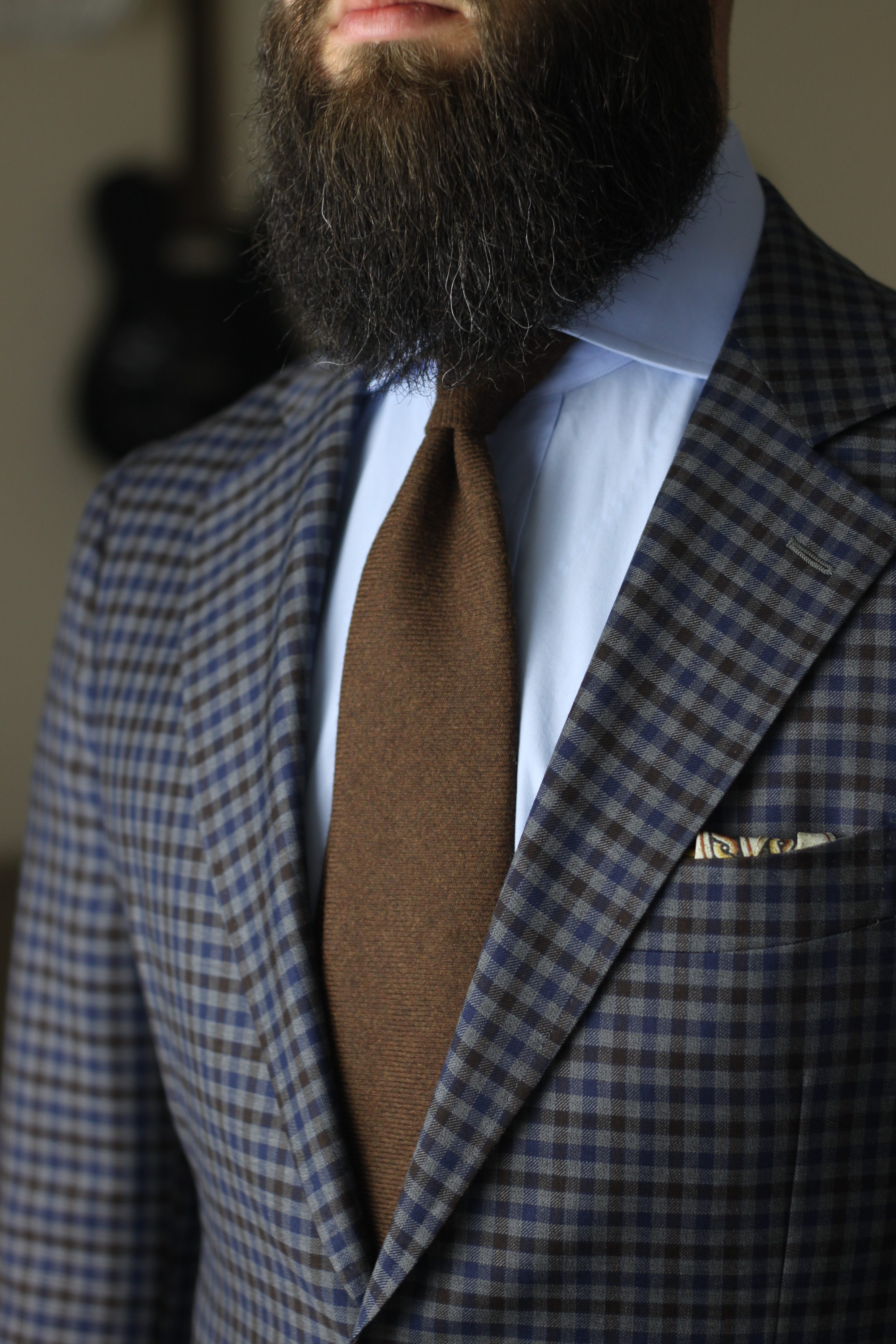
What I Wore – Denim Shirt
I wrote about pairing light ties with dark shirts and light jackets (as well as a number of other light-tie combos) a month or two ago. I think this is a nice example of a successful execution.
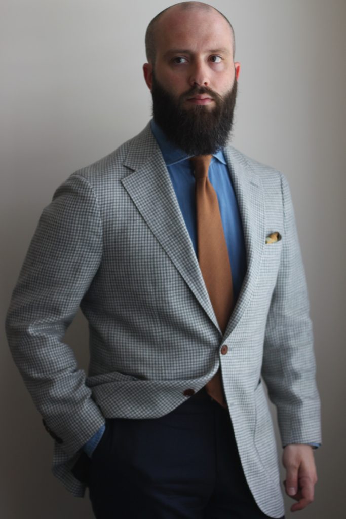
The navy trousers were maybe a bit too dark for the rest of the look, and in this photo the orange tone of the tie is quite impactful. Rampley & Co’s Battle of Trafalgar pocket square is the final touch – bringing tones from the shirt and tie into the breast pocket.
Planning What I Wear
When I have time, I like to plan ahead for the week by at least outlining the outfits I’ll be wearing. There are sometimes last minute substitutions, but for the most part I will put the time in ahead of time to plan everything out. Using my Dapper Woodworks hanger to see how things come together is a part of my routine now.
This post is a little late… and will be quickly followed by a look back at June. Real life has been extra busy lately!
-Colin