What I Wore: February 2018
Month 2 in the bag
I almost didn’t wait until the end of the month to post this. There were a lot of outfits I wore in February that I was pretty pleased with and wanted to review. Maybe in March I will start doing this twice a month. Though it may be a longer post this time, it will follow the format from previous What I Wore posts (January, 2017).
So here we go!
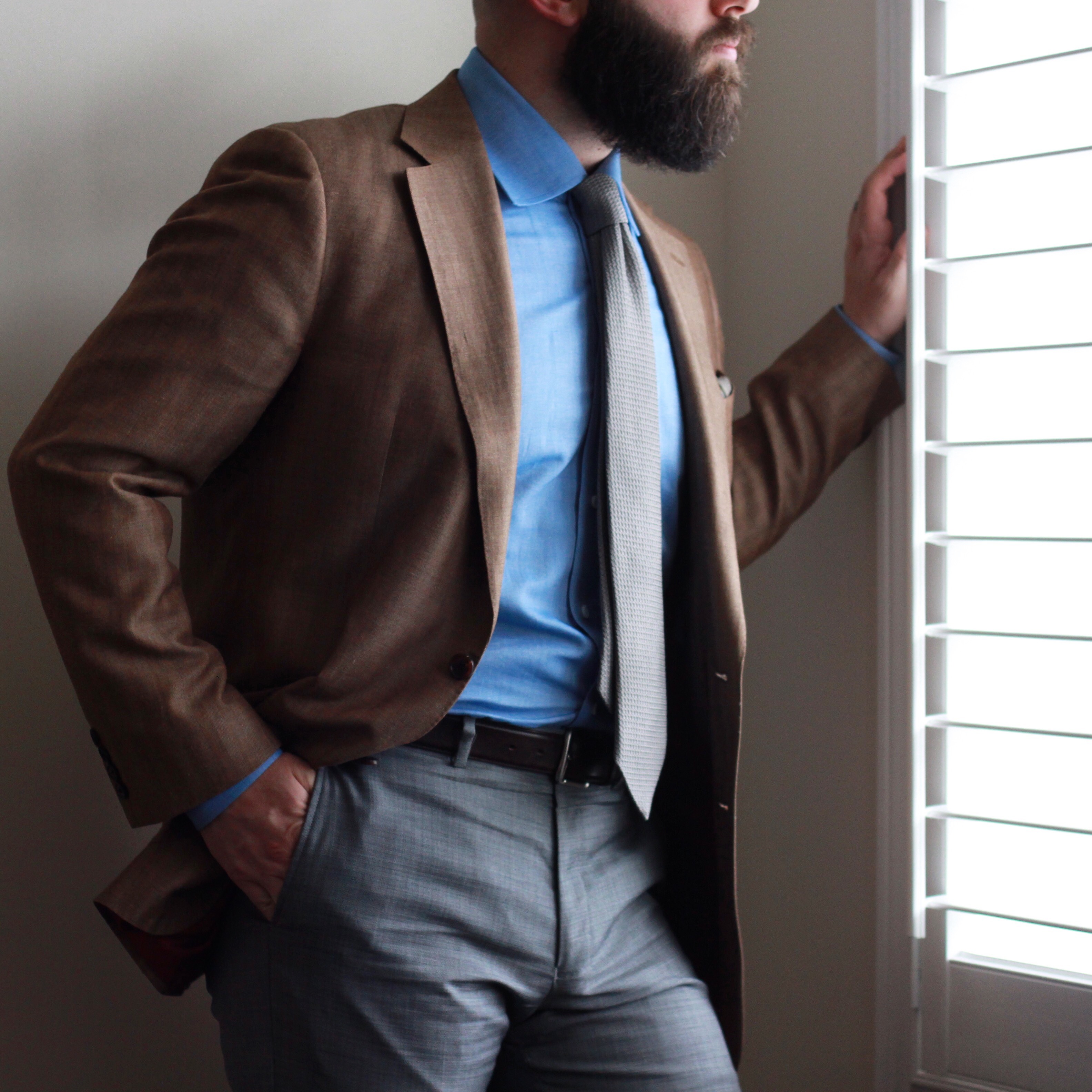
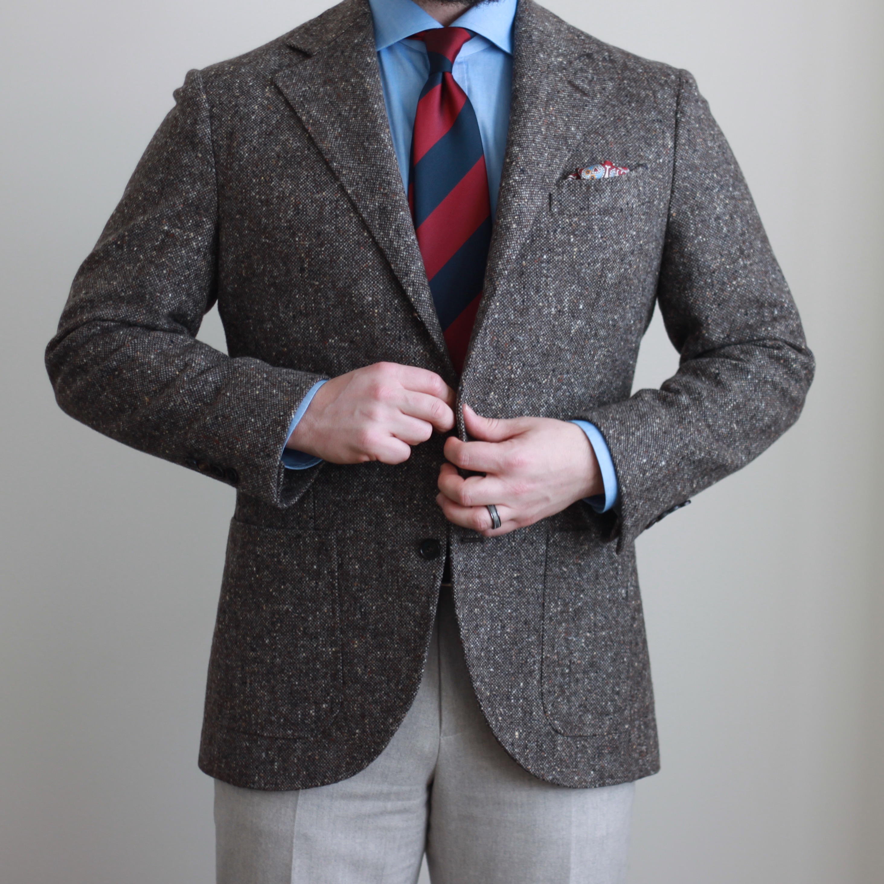
What I Wore: Donegal
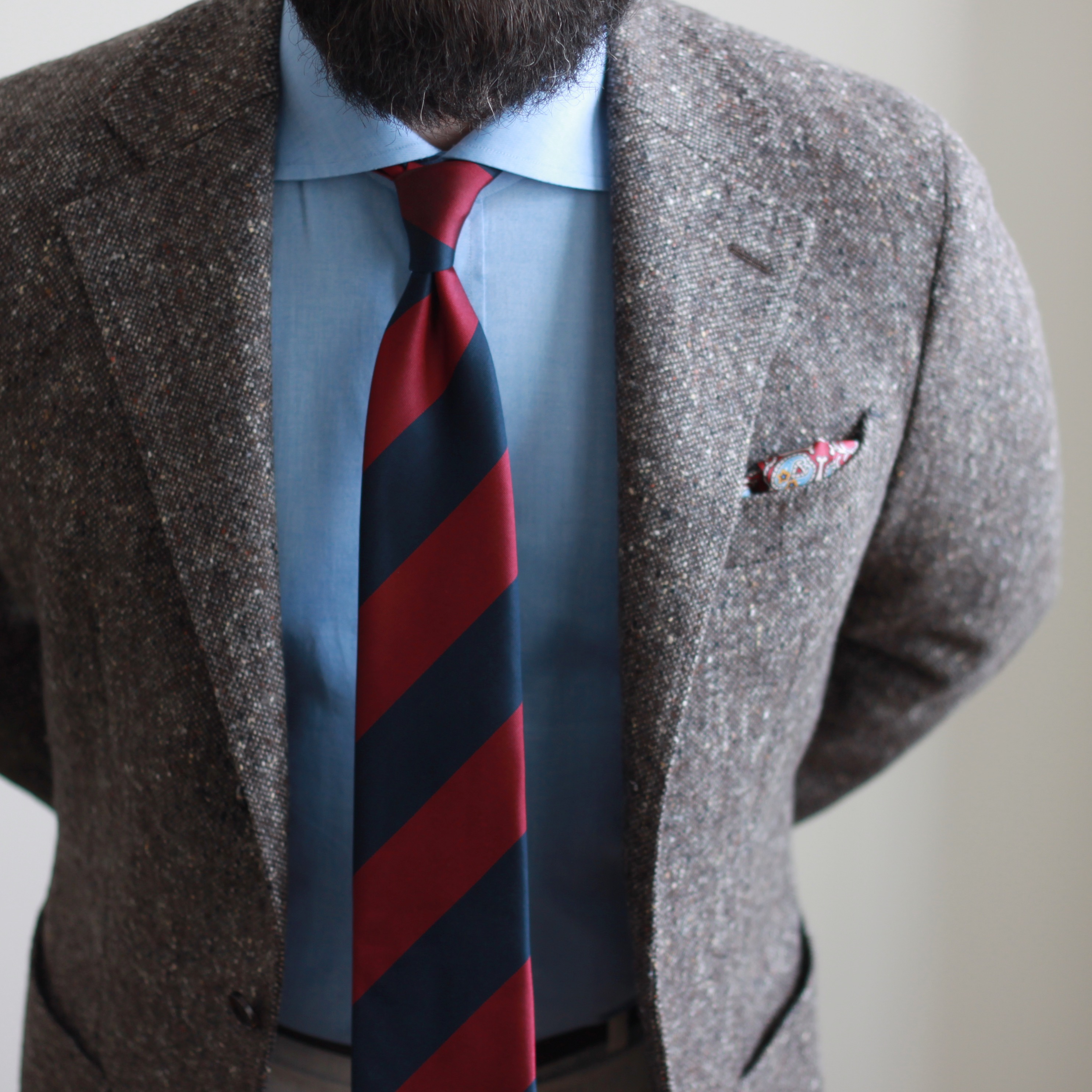
This outfit was actually constructed while I was shooting photos for the header images on the home page. The Donegal is very mottled, full of flecks of other colours but overall is reasonably subdued. Of course it also has that great tweed texture. A perfect counter point seemed to be the silk tie – smooth texture and high contrast colours with very sharp division. To bridge the two pieces, I chose a chambray shirt. It’s a saturated blue with a texture that falls somewhere between the tweed and silk. Down below, I’m wearing my light brown Vitale Barberis Canonico flannel trousers. The last touch was the pocket square, a burgundy based pattern featuring accents of light blue, gold and grey. I’m not crazy about the fold, as it looks a little bit like there is an owl or something peeking out of my breast pocket.
This is what I wore to start off the month of February. If I had to change something in the outfit, I think it would be the pocket square. I think a cream based choice would have worked with the colours, and let the tie stand more on its own. Another option would have been to go with darker trousers. This might be an instance where navy could have worked to help ground the boldness of the tie.
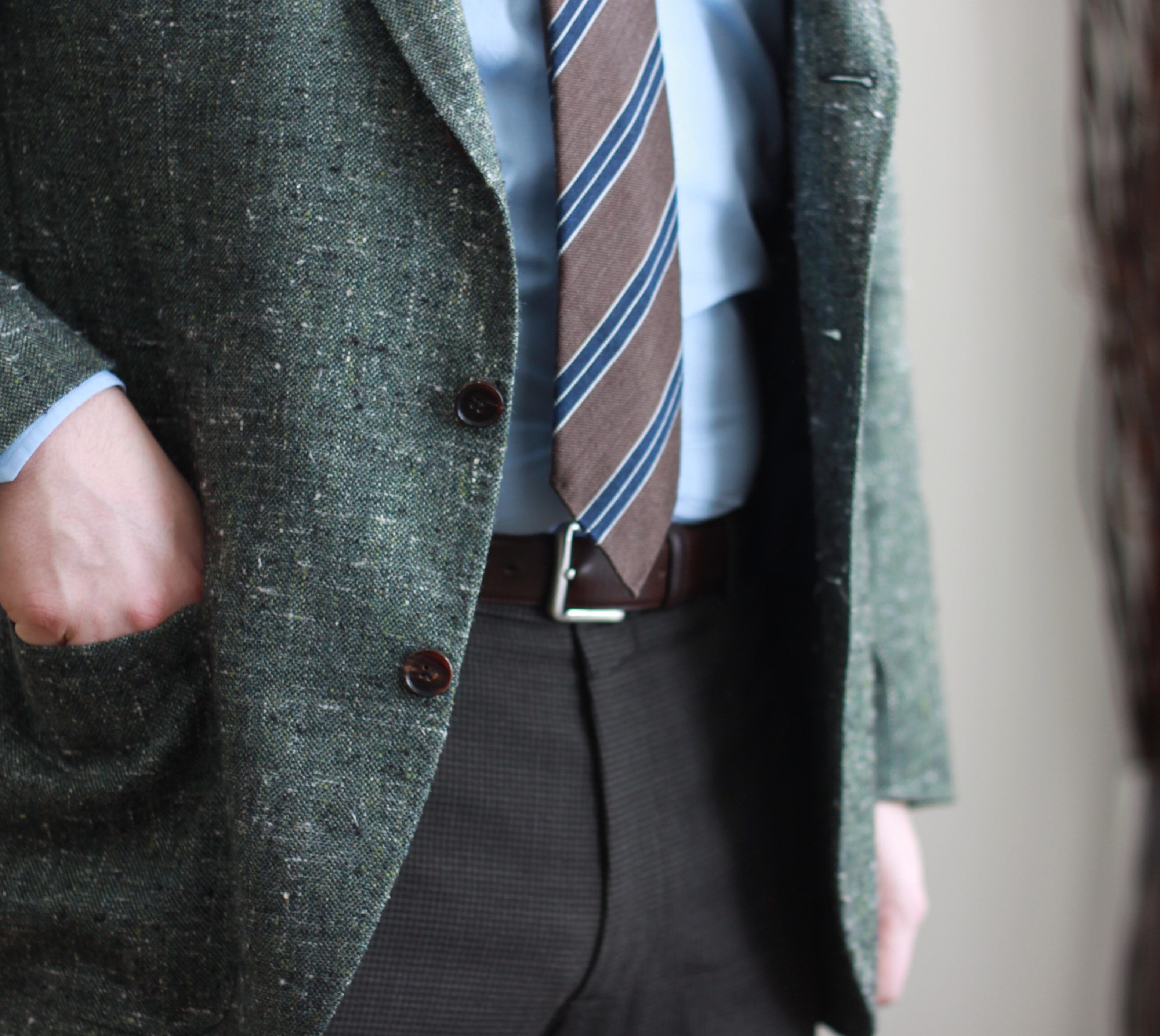
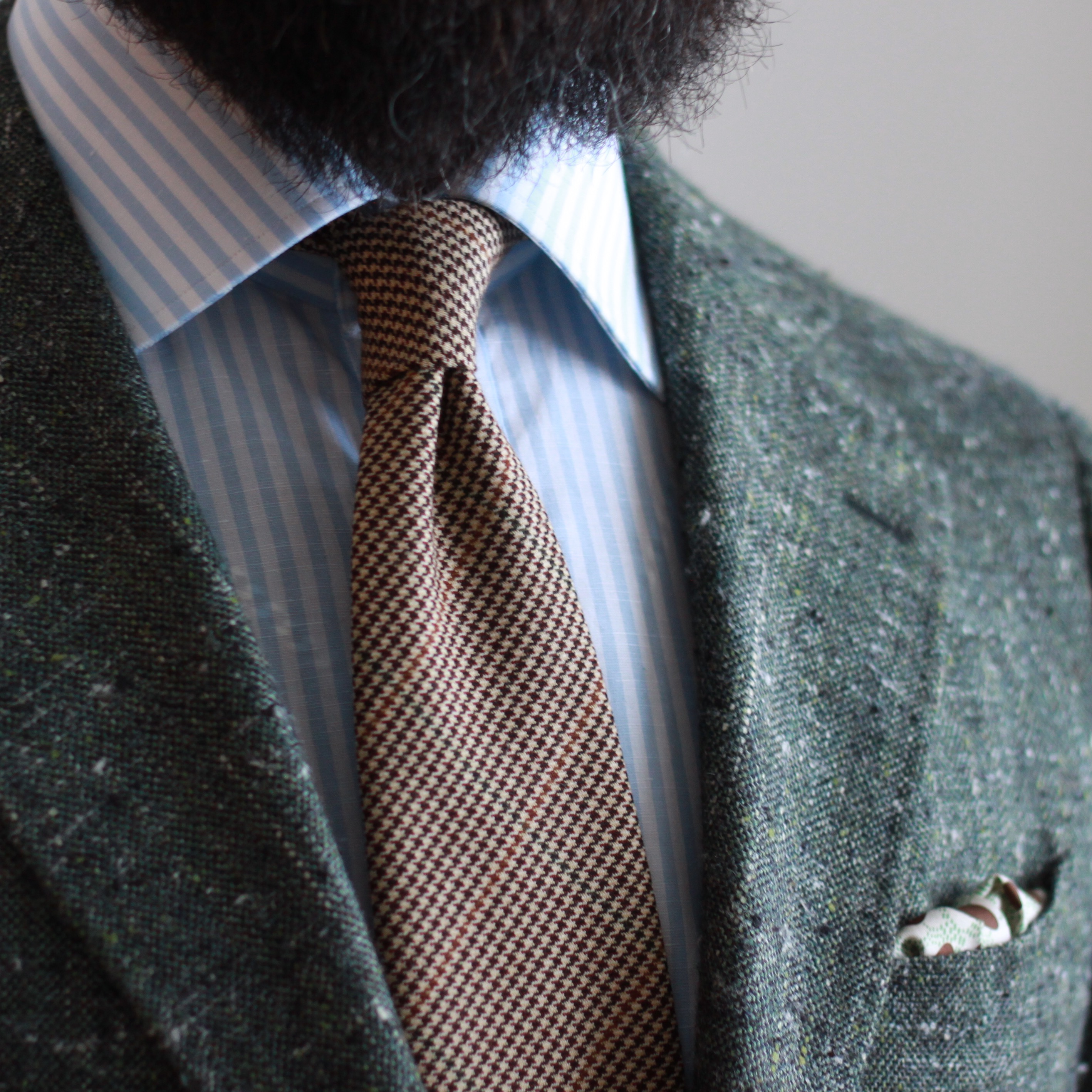
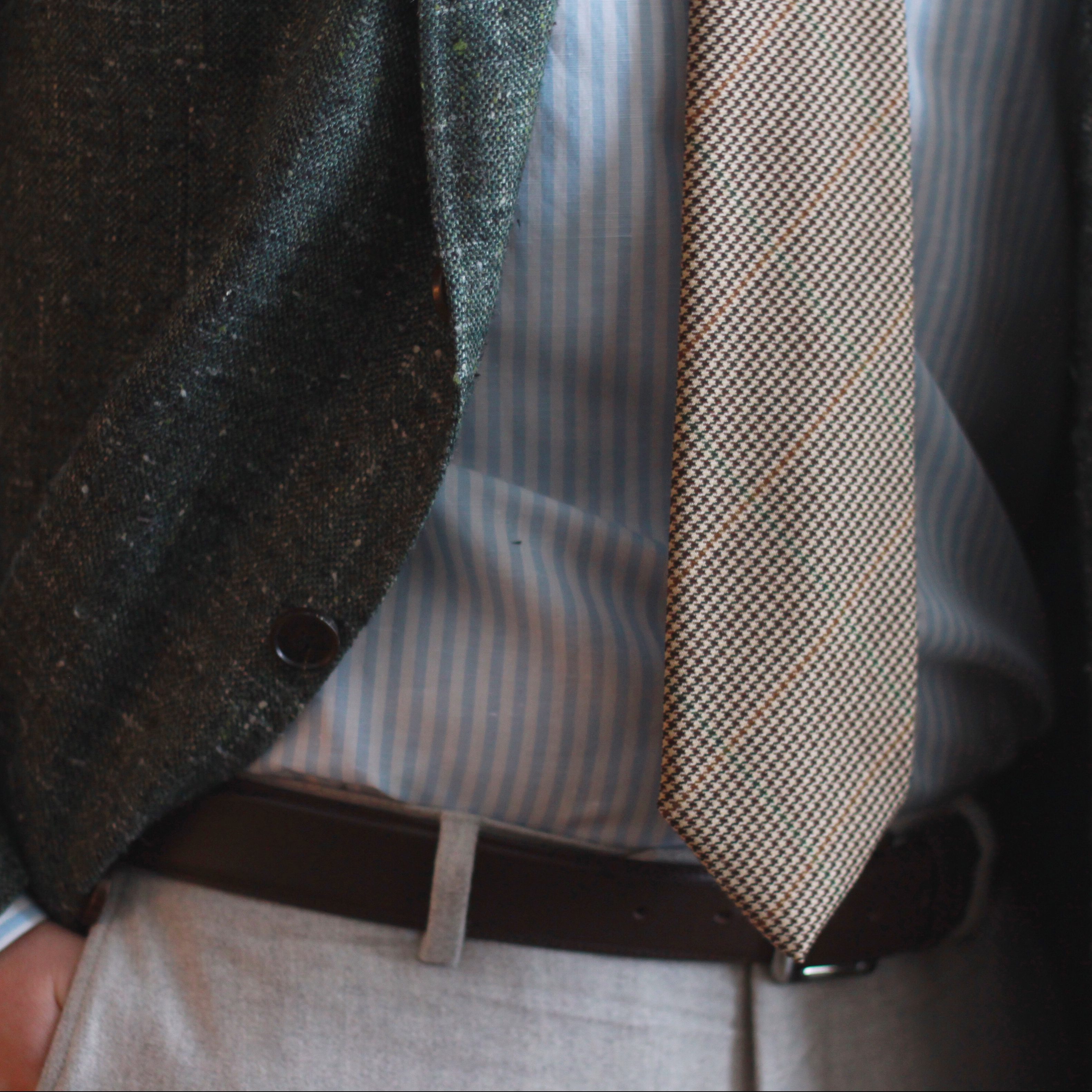
What I Wore: Green slub
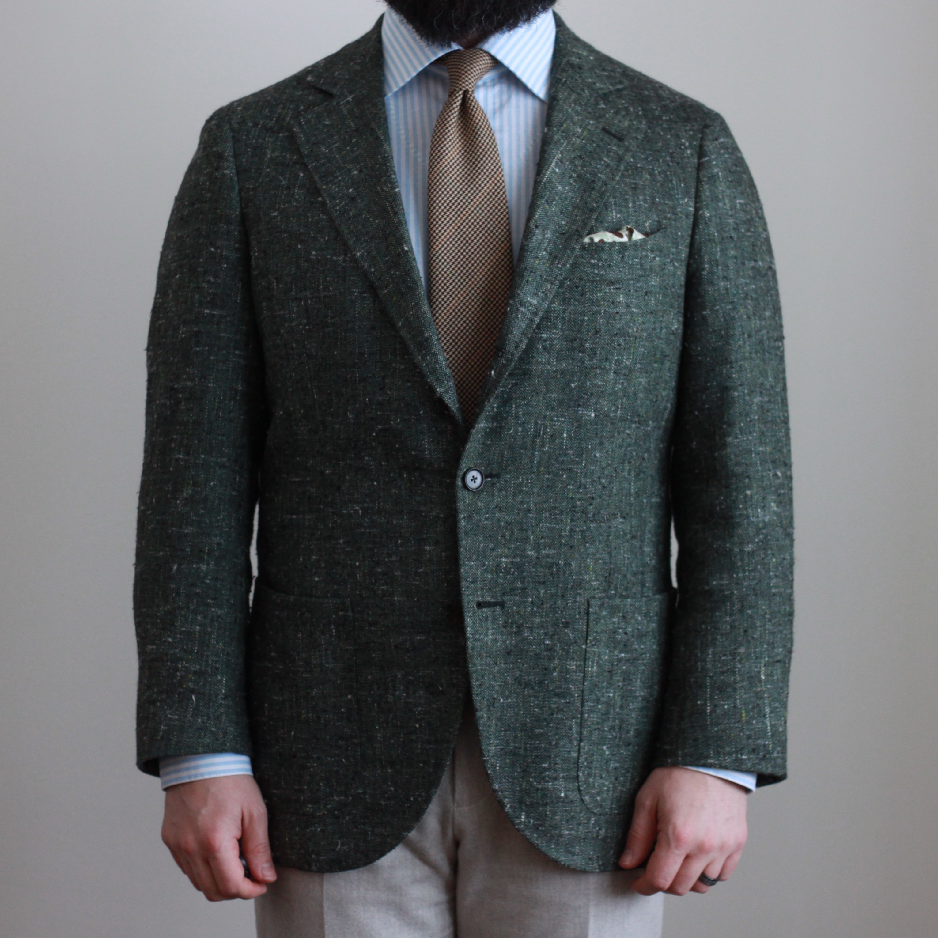
I’ve written about my love for this jacket before. Fantastic shade of green, with the added visual interest of the multi-coloured slubs. Did I mention it is soft? Not just the fabric. Completely unstructured. This outfit features a new shirt: light blue oban stripe from Spier & Mackay. I mistakenly ordered the semi-spread collar instead of my usual modified full spread. I actually like it though, and it’s nice to have a little variation in my shirt wardrobe. The tie is a Brooks Brothers “Irregular” number I picked up from Luxeswap on eBay. It’s quite a nice tie – caramel base with a chocolate brown houndstooth pattern that features a mid-brown and green overcheck. Lastly, the pocket square is by Tom Ford that is a creamy base with light green and brown spots. The colour palette I used here is actually quite similar to the outfit below, though there’s no navy blue. This resulted in a lighter, lower contrast look that I think worked quite well.
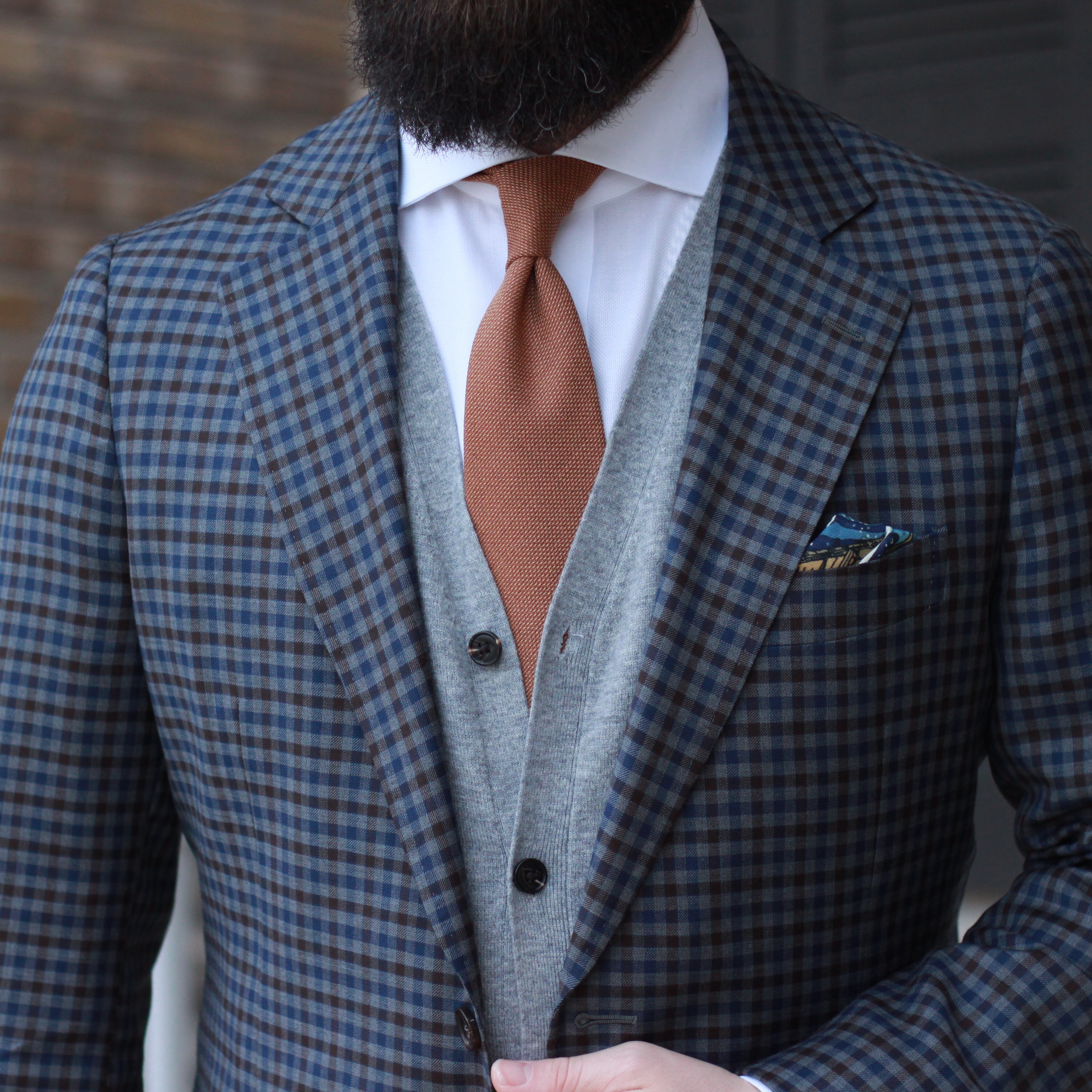
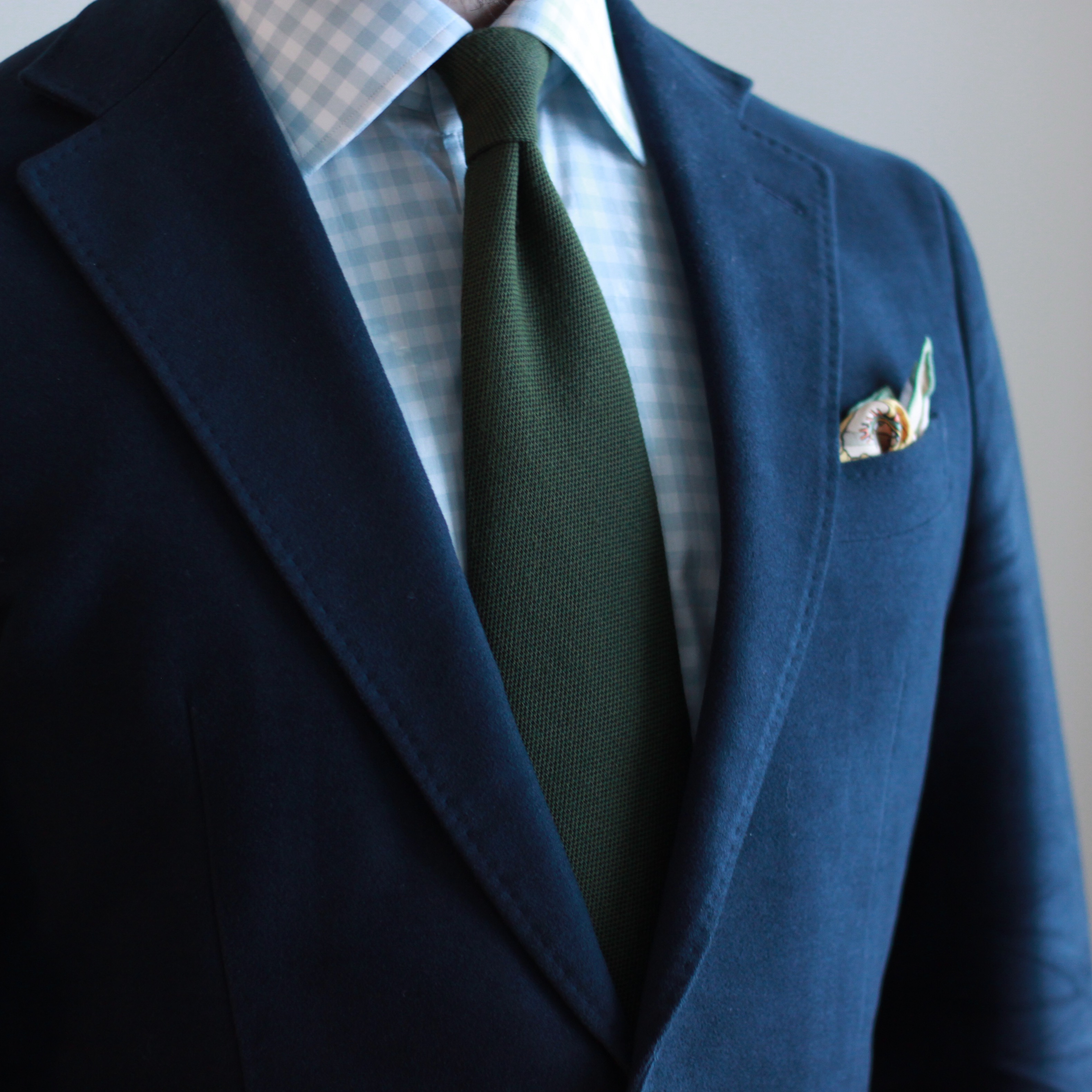
What I Wore: Moleskin
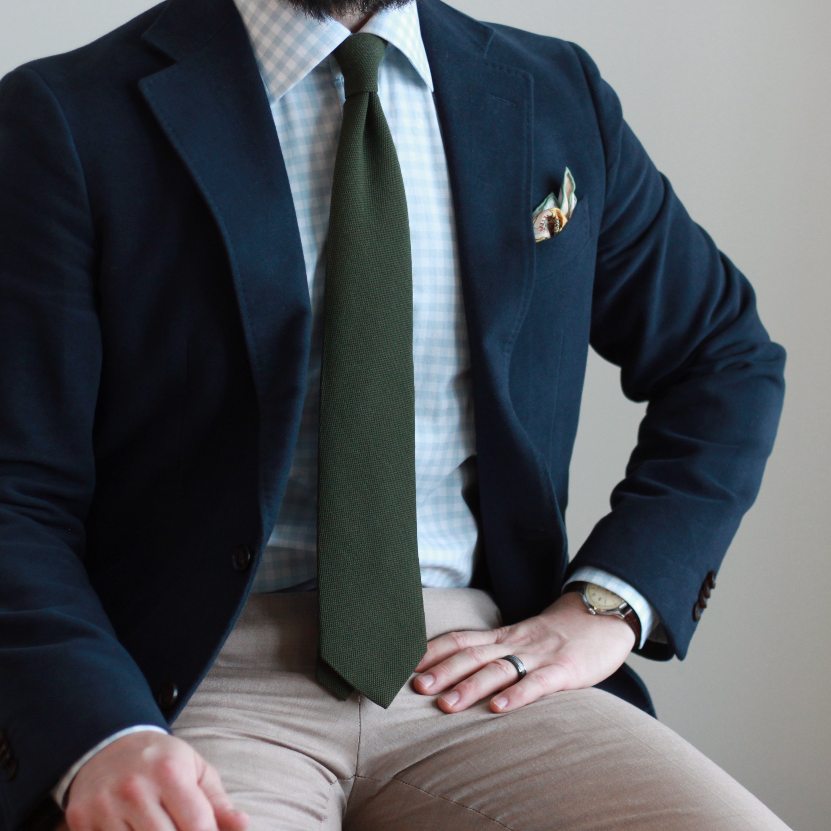
There was something about how the colours and textures came together in this outfit that I really enjoyed. The camel flannel trousers have a soft, variegated look. The navy moleskin odd jacket has wonderful depth. The warm green wool tie adds texture and subtle pattern. Putting these together was a no brainer. I think it was the soft mint gingham shirt (Spier & Mackay) and the Rickshaw Cart pocket square (Kent Wang) that really solidified the fit. The colours in the shirt is a great go-between for the jacket and tie. The pocket square pulls the colour of the trousers up into the top block, and picks up elements from the rest of the pieces.
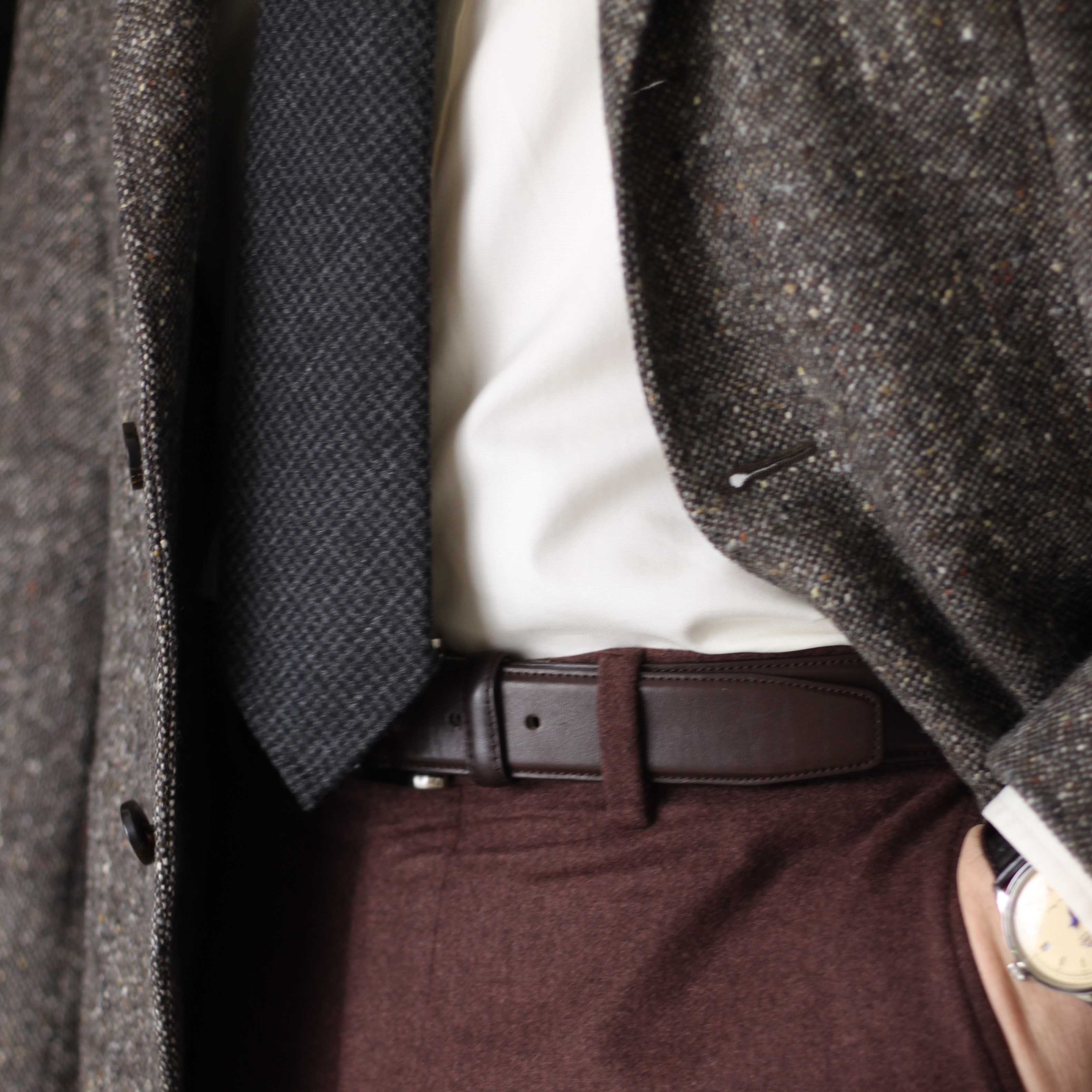
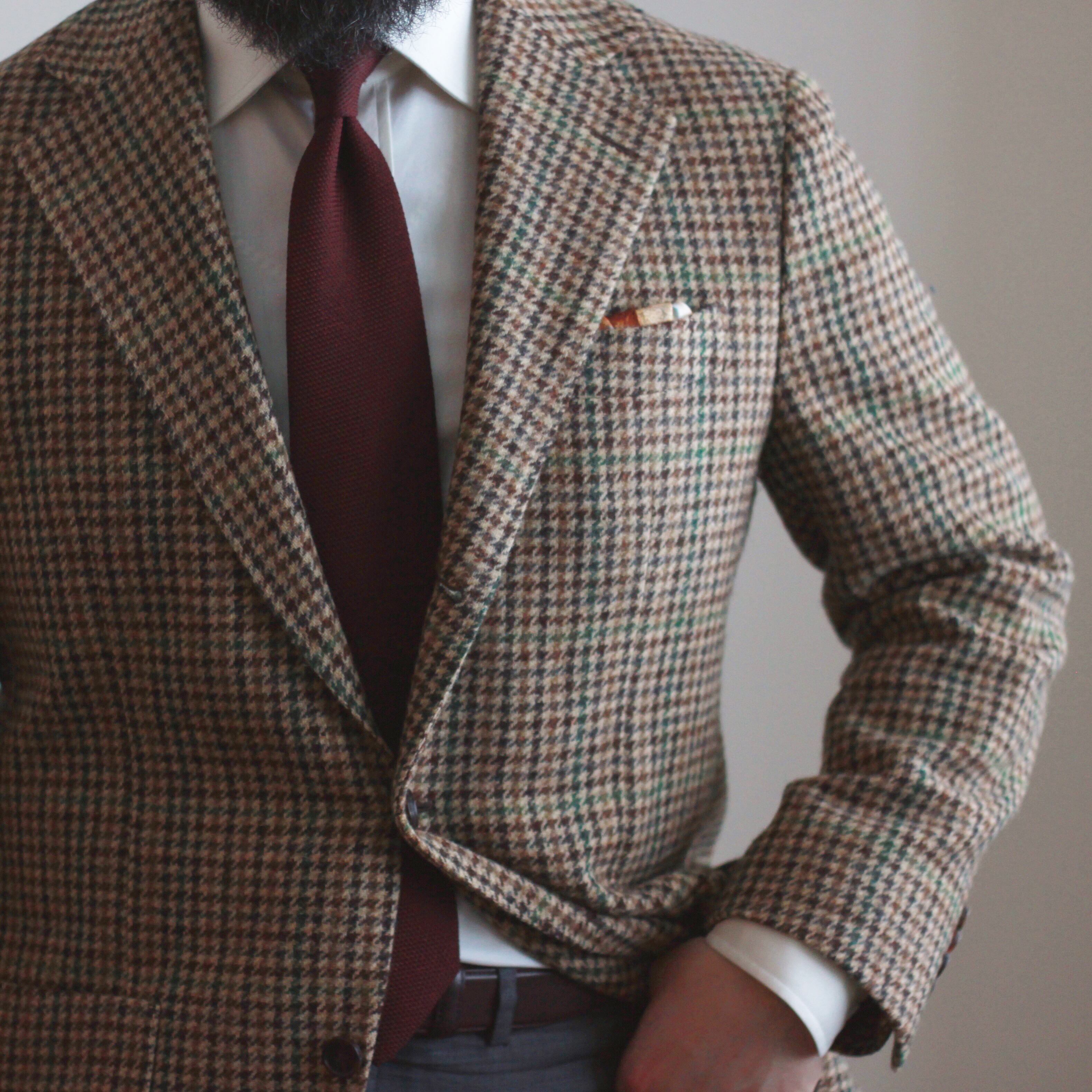
What I Wore: Tweed check
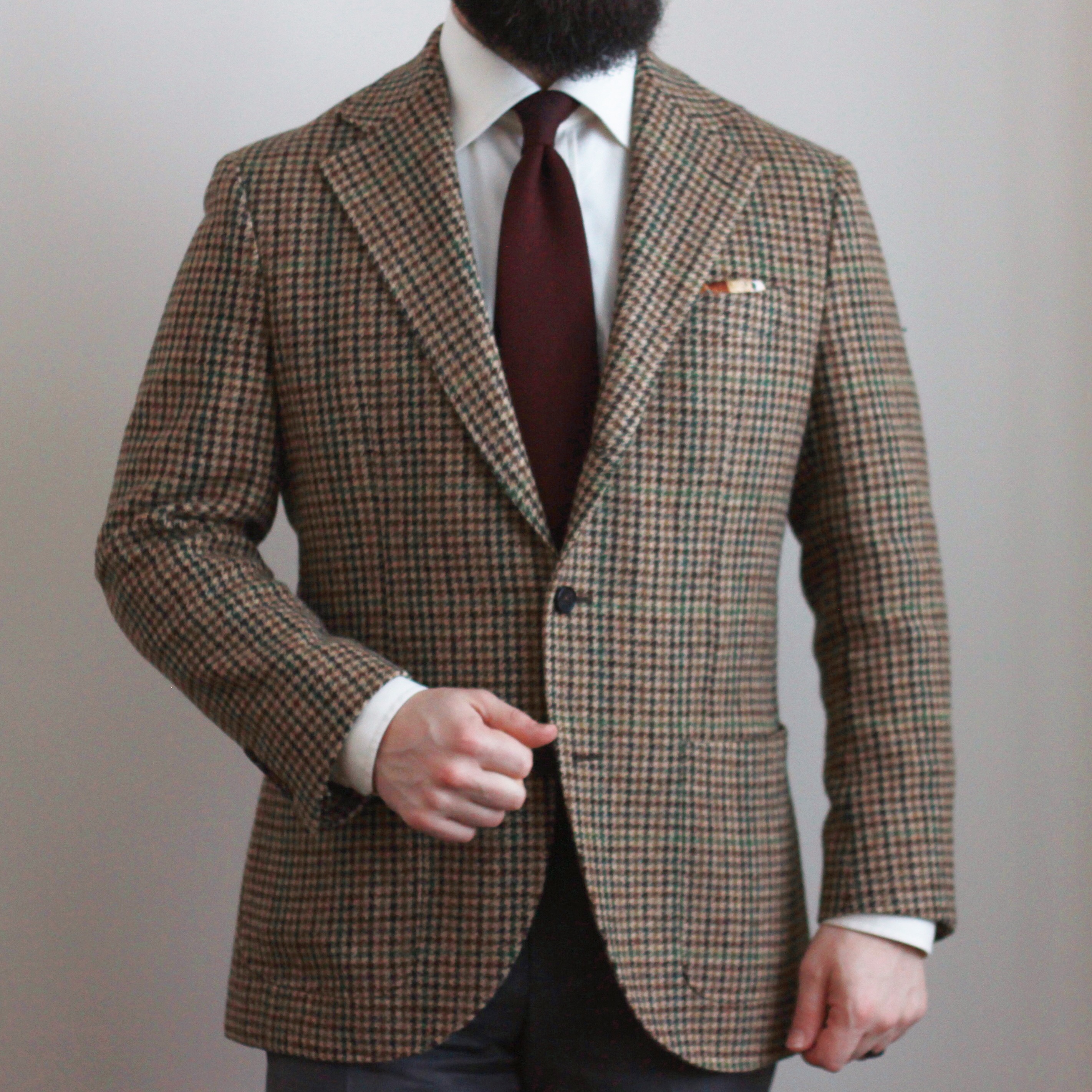
Around this time of year, I’m getting excited for spring to show up. However, I’ll be sad to put this jacket away. It’s a fantastic tweed, with an oatmeal base featuring a large-scale houndstooth pattern in brown, caramel, grey, and two shades of green. In this outfit, I challenged myself to not play directly off the colours in the jacket’s check. I selected my ecru shirt (which I’m finding to be extremely versatile!) and a burgundy grenadine fina from Sam Hober. In my breast pocket is the limited edition Master Shoemaker pocket square made by Vanda Fine Clothing. I think the pocket square pairs well with the tie, as the darker shades seem to meet the burgundy of the tie, and the brown of the jacket check halfway. Burgundy seemed a good choice of tie against the colour and pattern of the jacket. The off-white tone shirt helps with this colour combination. A blue or white shirt would have set too high a contrast between the tie and jacket, and the ecru shirt lends a bit of brown cast to the tie that helps it fit in.
February was a pretty good month in my eyes. What do you think? Is there anything you’d change in these examples of what I wore?

-Colin