Inspiration: One pocket square, four ways – Kent Wang Great Wave
The Great Wave off Kanagawa
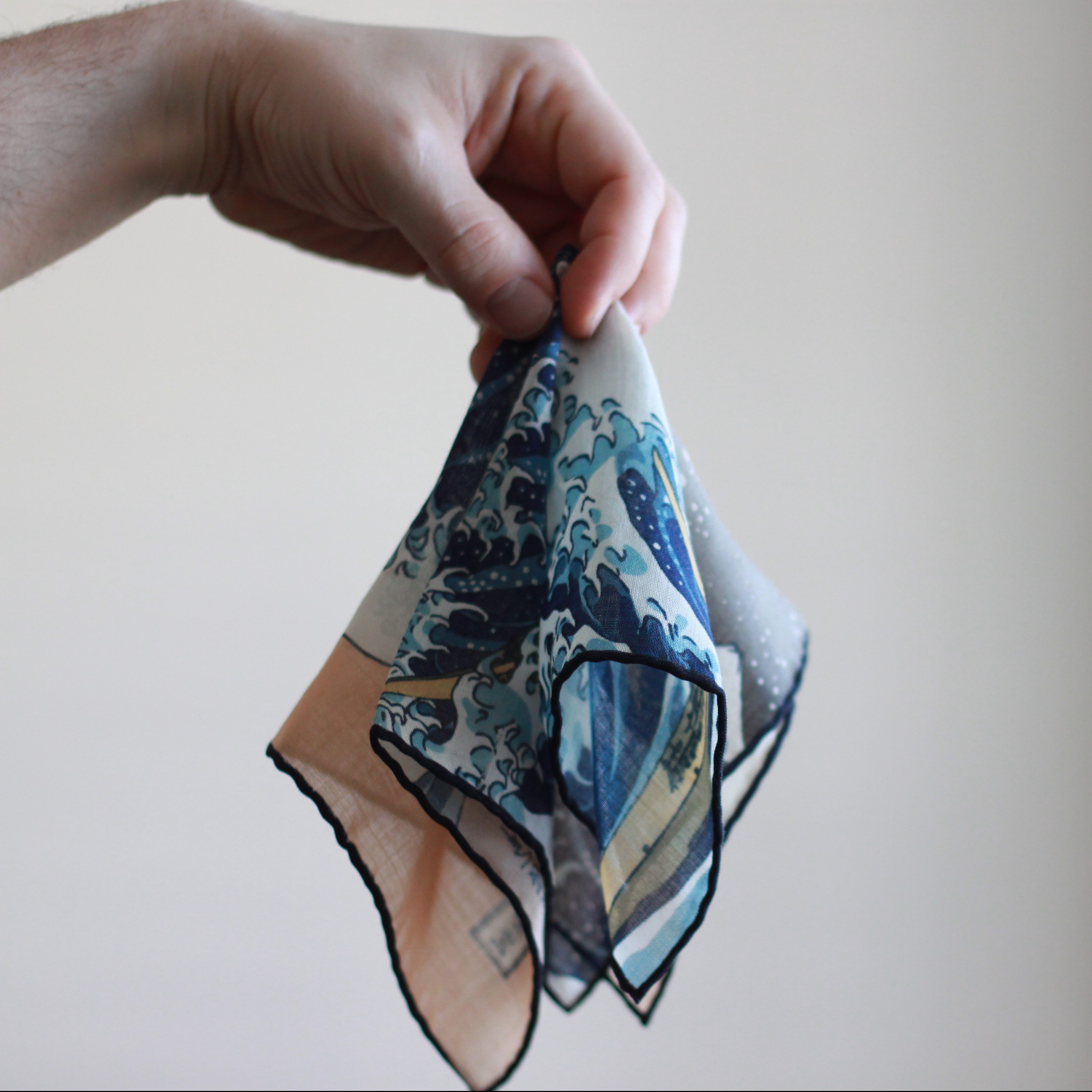
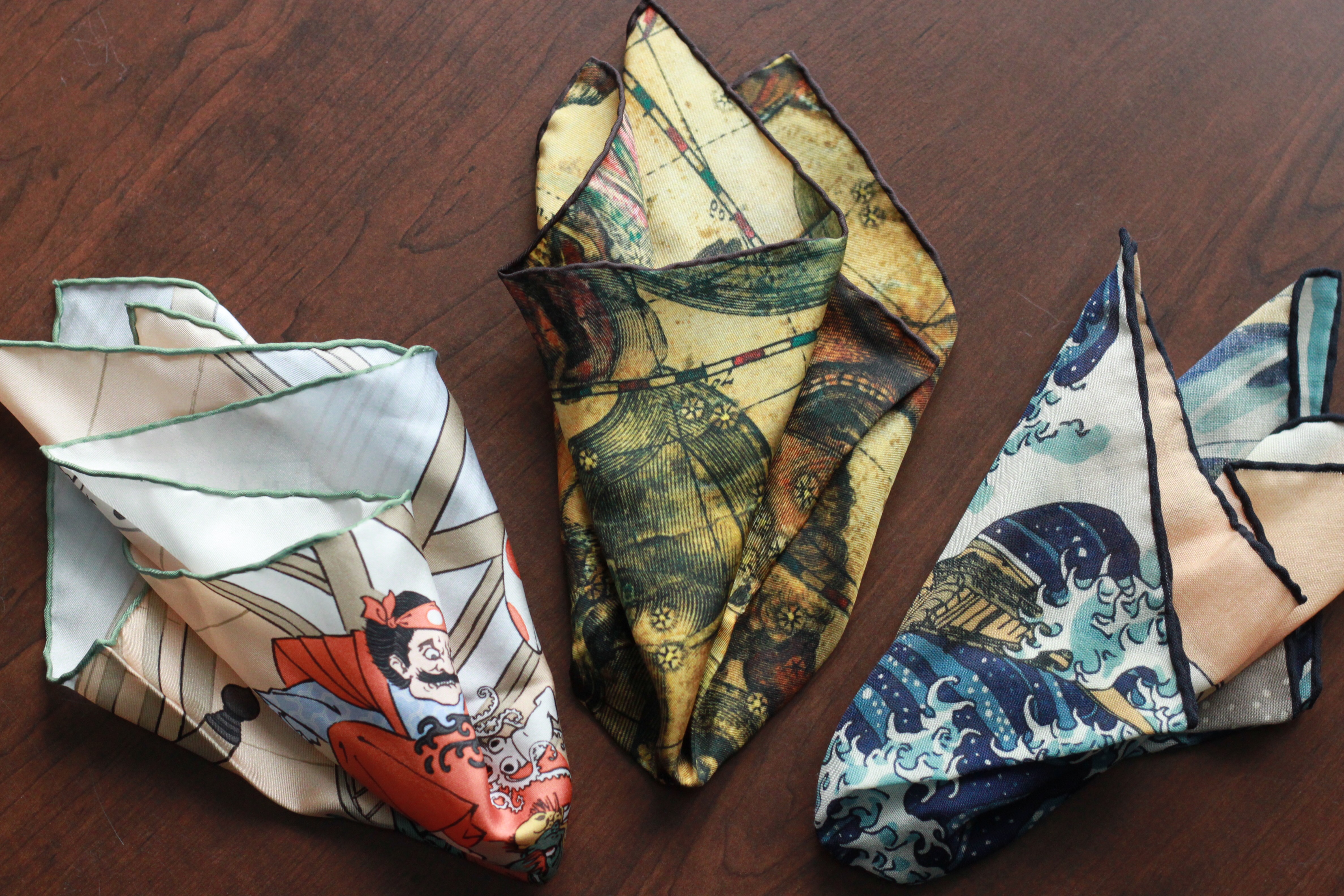
This might be my favourite pocket square. It was easy to find four combinations that I liked it in. If you want some more pocket square inspiration, here’s another post like this. The colours make it extremely versatile: many shades of blue, cream, grey, and brown. I have the wool/silk blend which adds some beautiful texture and less sheen than a pure silk version. From a functional standpoint this blend helps it stay in place when I fold and stuff it in my pocket. This is one of the times when making a purchase based on a desire to emulate worked out in my favour (read about some other times here). I reach for this pocket square pretty often – almost once a week.
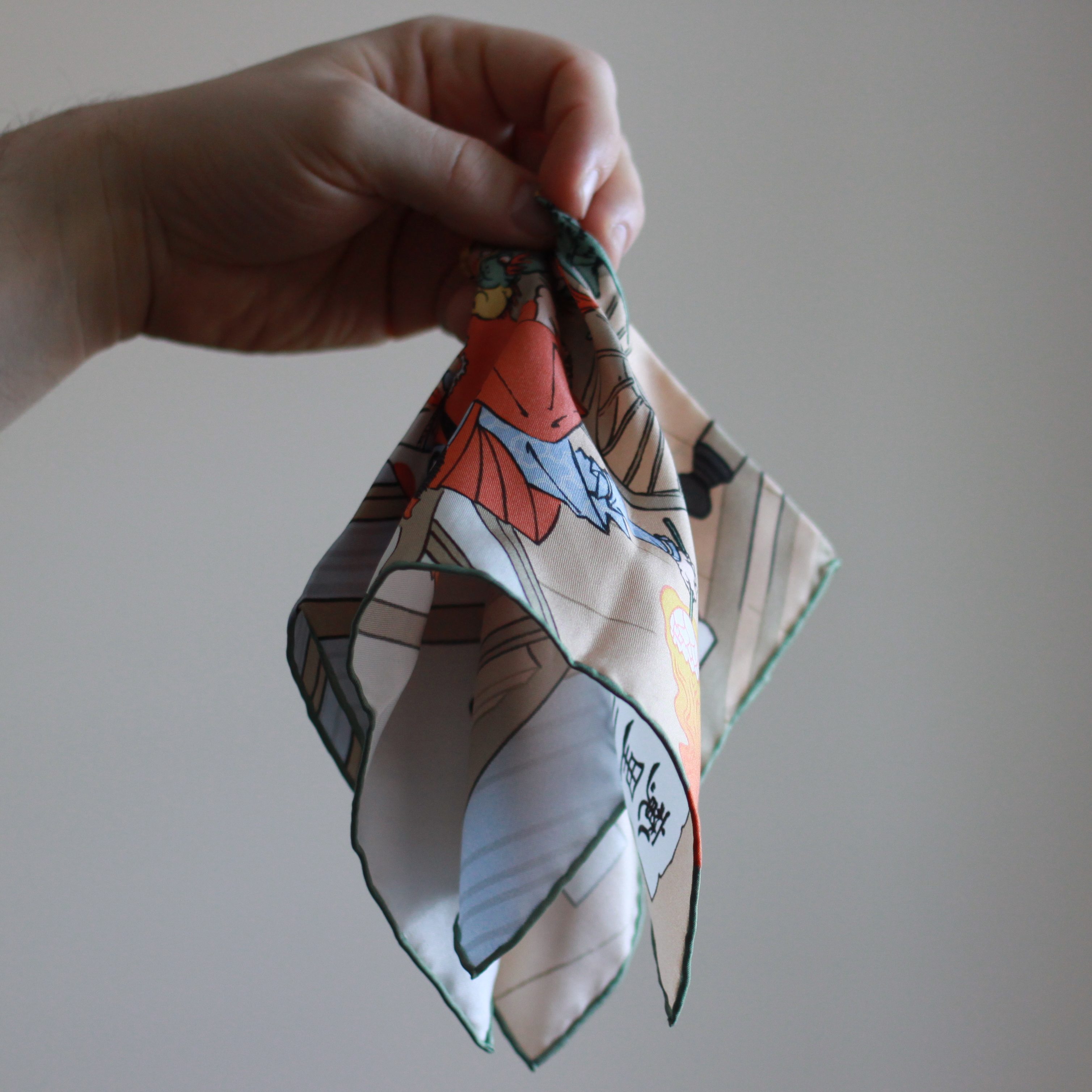
This pocket square is based off of a woodblock print from Japanese artist Katsushika Hokusai. It depicts a giant wave threatening boats, with Mount Fuji in the background. This was the first pocket square that I bought from Kent Wang and would highly recommend it as the first not-white-linen piece is anyone’s collection.
Here’s my lookbook:
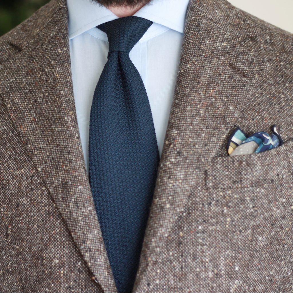
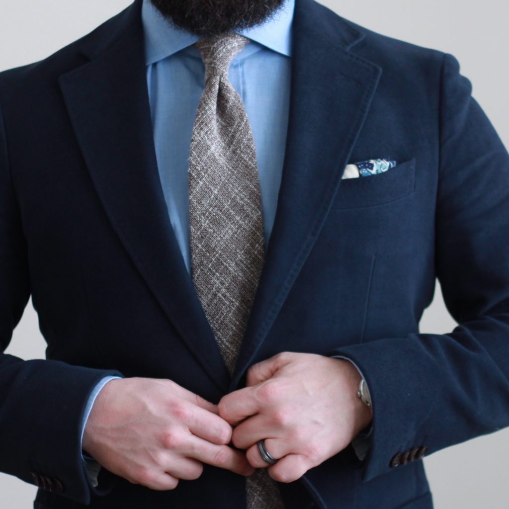
#1 - windowpane odd jacket, burgundy grenadine
In my post about putting together an outfit I wrote a bit about pairing the accessories. Often, the pocket square will have a tertiary or background colour that matches the tie. In other cases, the pocket square and tie will be used to accentuate other colours in the outfit. In this example, the burgundy grenadine fina from Sam Hober pairs with the burgundy in the jacket’s pattern. The Great Wave pocket square doesn’t have any burgundy in it. It does have grey, blue and white the way I folded it. The grey pulls up from the trousers, and the blue and white play off the blue dress chambray shirt and provide contrast to the dark blue jacket. I think for me, the way the pocket square was folded really added a nice detail to the outfit. Matching the burgundy would have been too much.
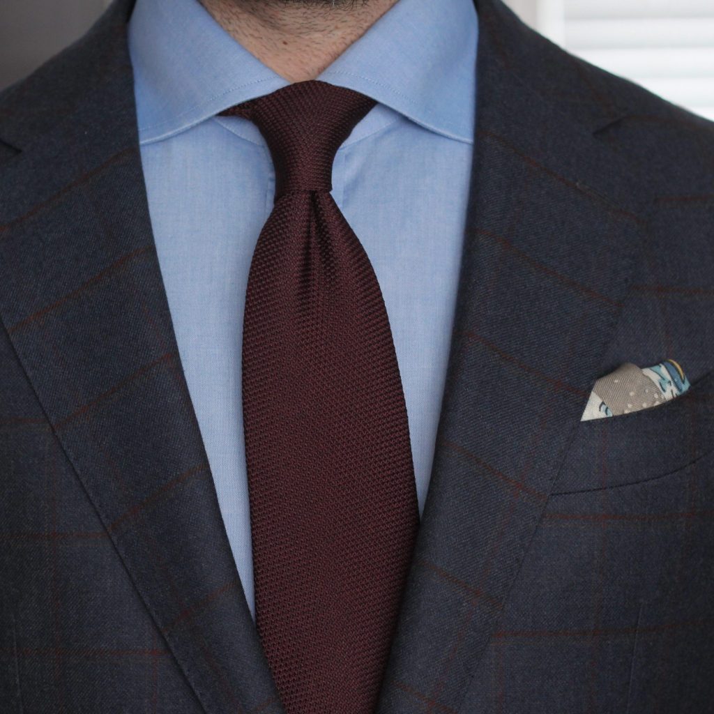
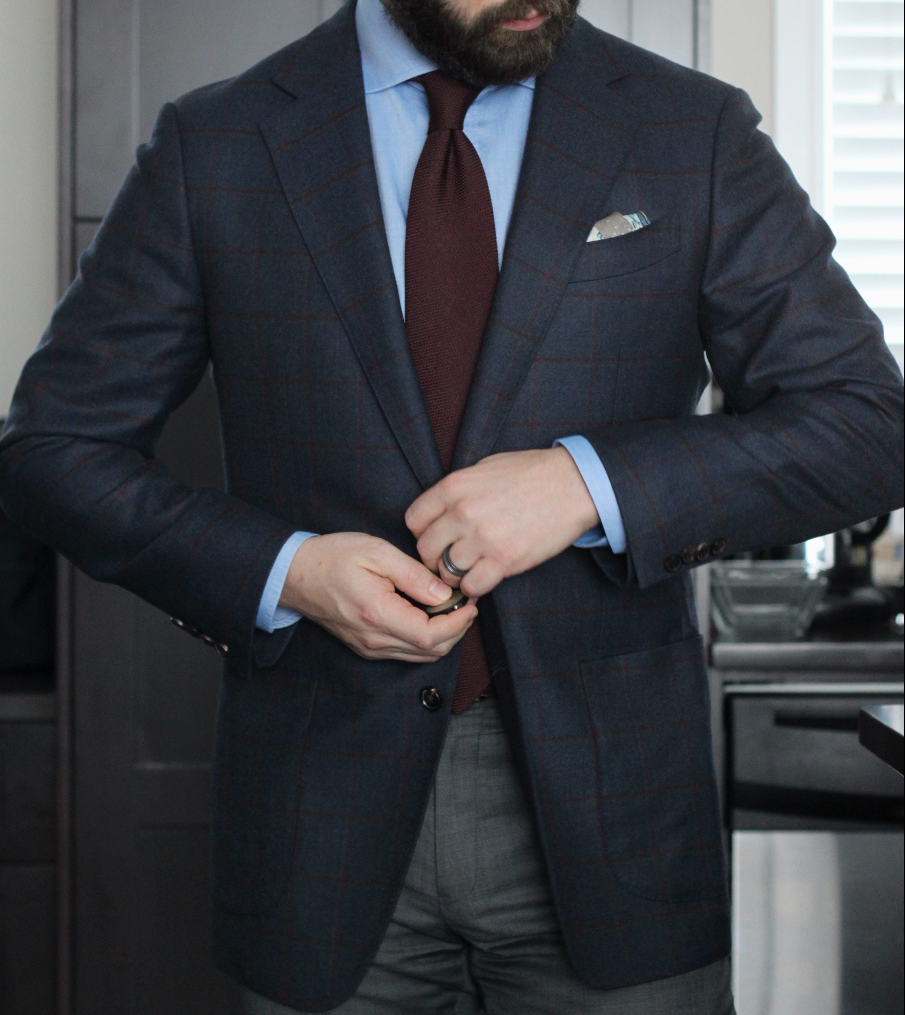
#2 - navy moleskin, brown tie
I was really happy with how this outfit came together. The soft, dark navy moleskin jacket provides stark contrast to the relatively light other pieces. The colour of the light brown flannel trousers from Vitale Barberis Canonico made up by Spier & Mackay, sharp blue poplin shirt, light brown cotton/linen tie from Vanda are all pulled together by the cream, white and blues in the Great Wave pocket square. Looking at the texture of the trousers, jacket and tie, the wool/silk blend of this version of Kent Wang’s pocket square was the perfect choice. A full silk would have been to “wet” or shiny. Textural contrast can be tricky – if some of the other pieces weren’t so “dry” and soft, a silk pocket square would have been fine. Colour-wise, these high/low contrast outfits are some of my favourites to wear.
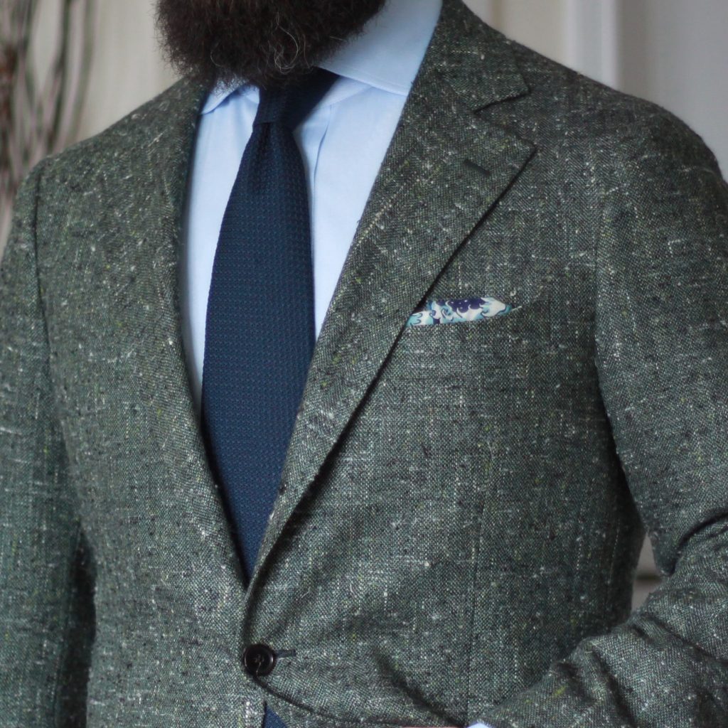
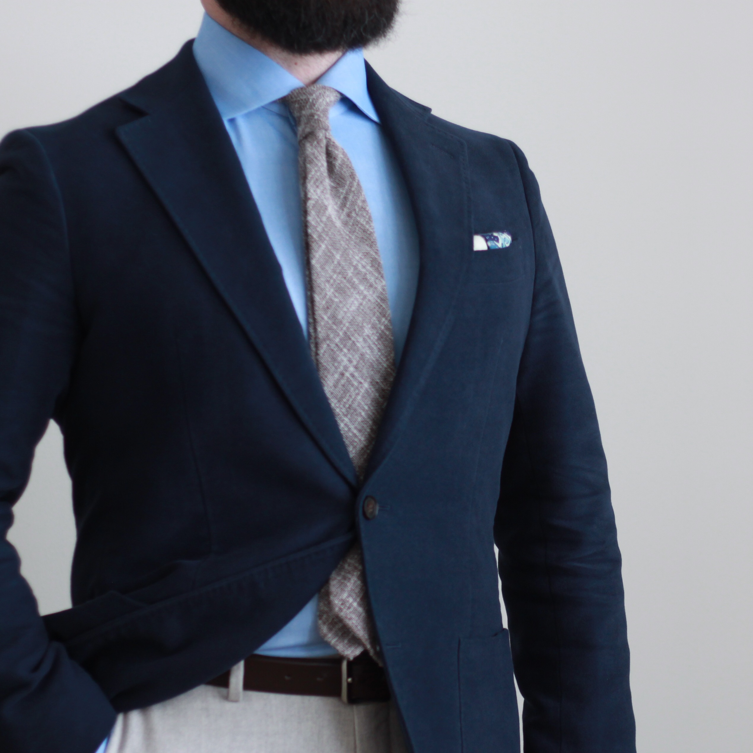
#3 - green slub, navy grenadine
Lots of saturated colours in this one. There’s a saying somewhere out there that goes, “blue and green should never be seen, unless there’s something in between.” or something to that effect. Another “rule” that I don’t really understand. I think the soft blue shirt, navy houndstooth trousers and navy grenadine (also from Kent Wang) all work really well next to the variegated green slub jacket. The jacket is a wool/silk/cashmere blend from E. Thomas made up by Spier & Mackay in a completely unstructured fit. In this instance, the Great Wave pocket square doesn’t provide much contrast to the jacket, but adds another couple of blue elements to the overall look. What I wanted to do here was let the green of the jacket be the focal point, with everything else resolving to shades of blue. I liked this outfit, though I do think the navy trousers were a bit much. I think swapping them out for mid or light grey would have been great.
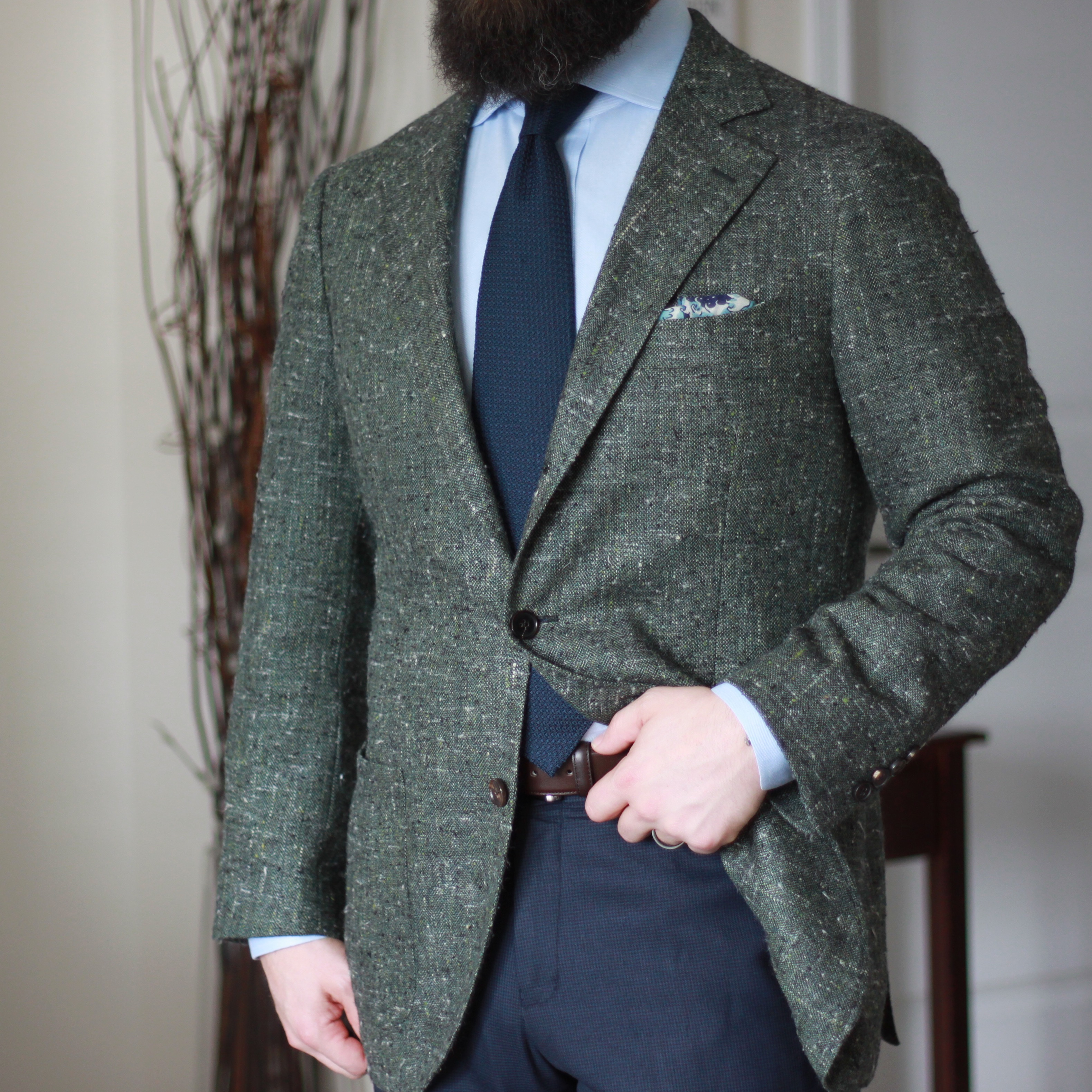
#4 - donegal tweed, navy grenadine
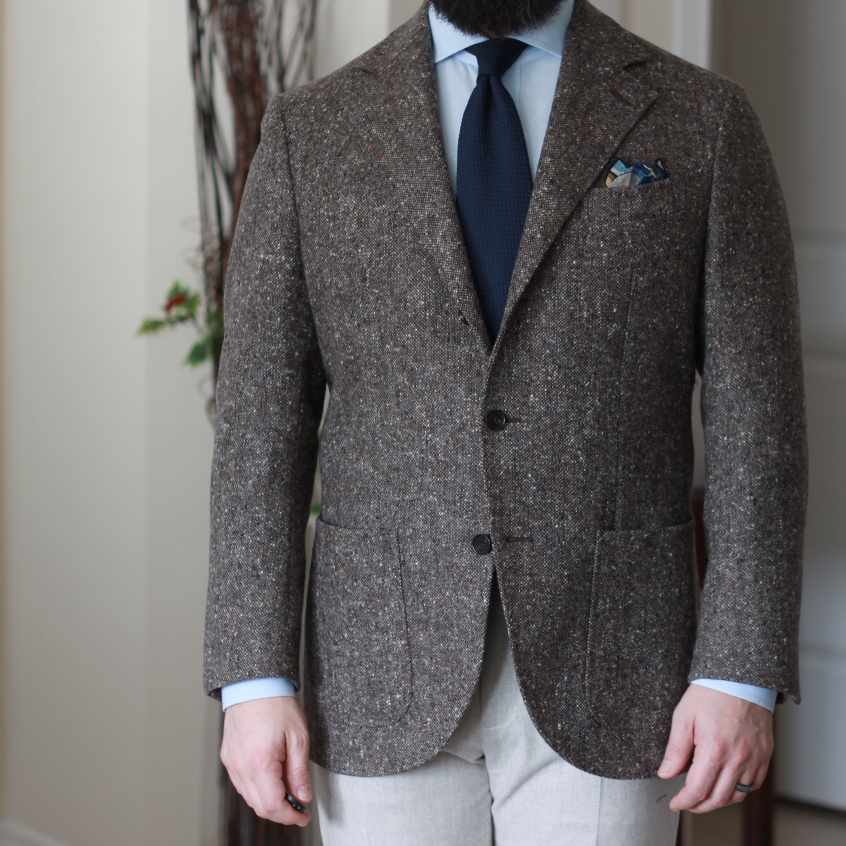
In this outfit, the Great Wave pocket square was folded and stuffed to show maximum colours. Blue, white, grey, cream and brown – pulling together elements from all over the outfit. The Donegal tweed jacket and light brown flannel trousers are in the same warm, tonal family. The navy grenadine tie is more saturated and appears quite vibrant against the light blue shirt. I was happy with how the pocket square folded here, as there are parts showing that blend with the jacket, and others that jump out. The blues in it give an extra point of reference for the blue shirt and tie. I think this outfit worked as it seems to be a 50:50 weighting of colours – blue and brown – for an overall balanced look. The saturation of the tie and pocket square have enough visual clout to stand up with the heavy texture and flecked colours of the Donegal tweed jacket.
So, that’s my Great Wave pocket square from Kent Wang four ways.
-Colin