What I Wore – September 2018
Shoulder Season
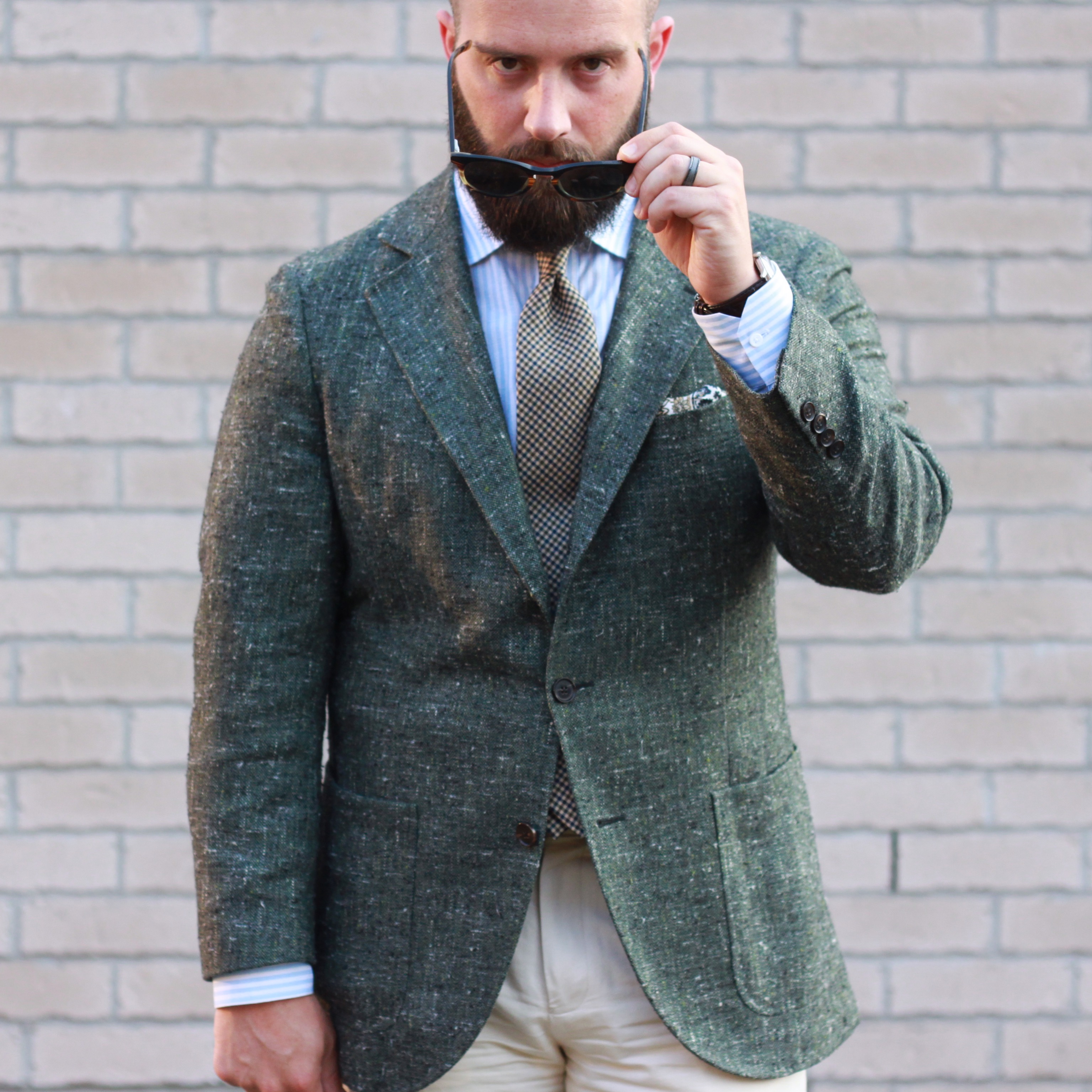
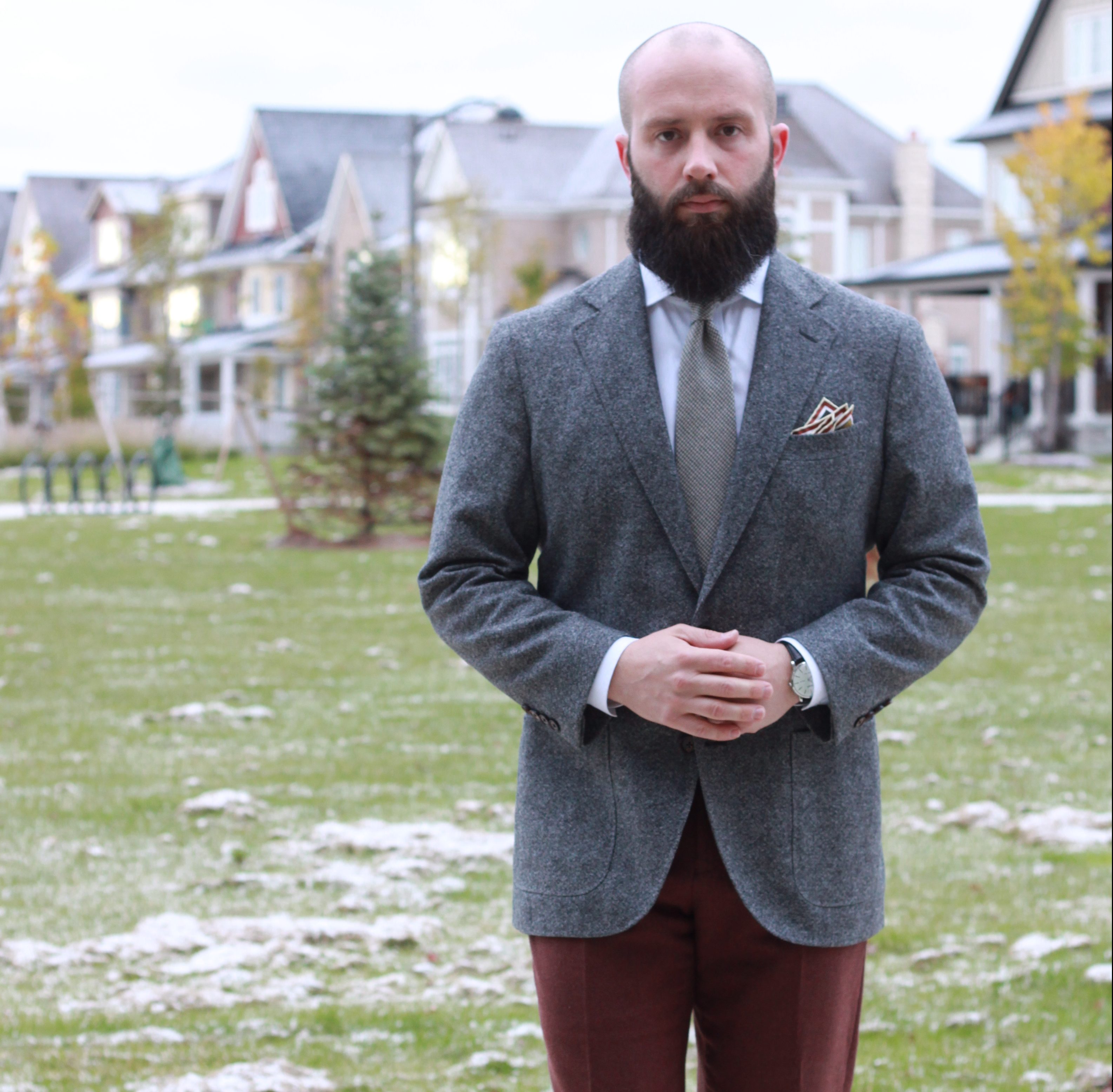
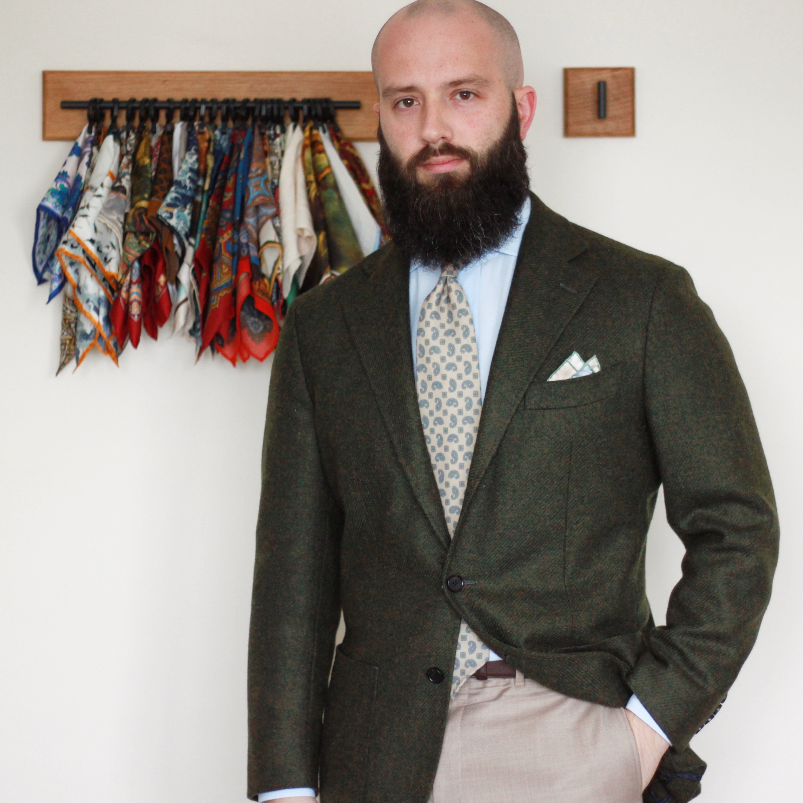
After a scorching hot August, September cooled off near the end of the month without much fuss. This week I will be preparing to put away my Spring/Summer sport coats and trousers, and pulling out the heavy weight stuff. I managed to squeeze in one piece, my moleskin sport coat, but September was mostly the last hurrah for lighter fabrics. In no particular order, here are some outfits from September:
What I Wore - red checks
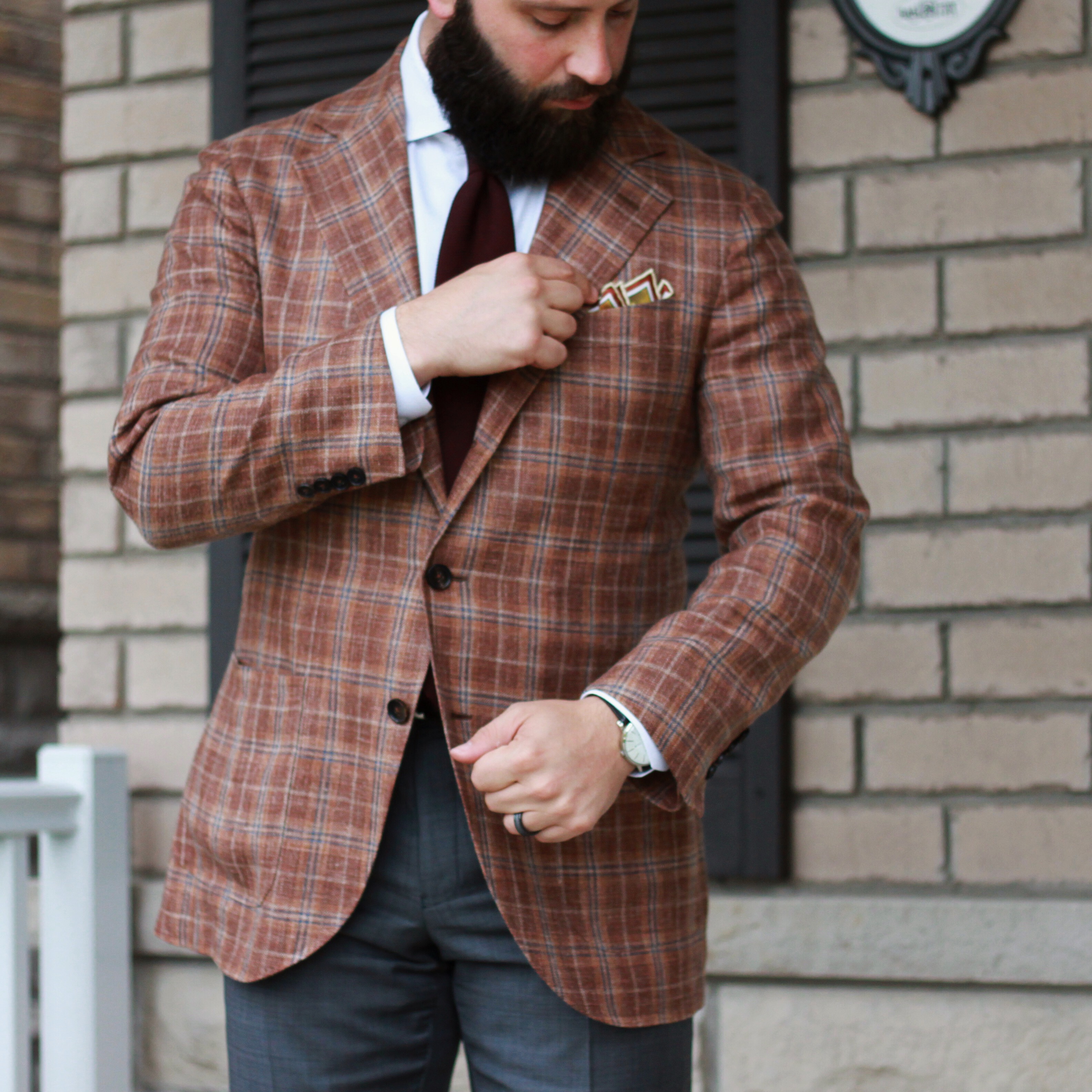
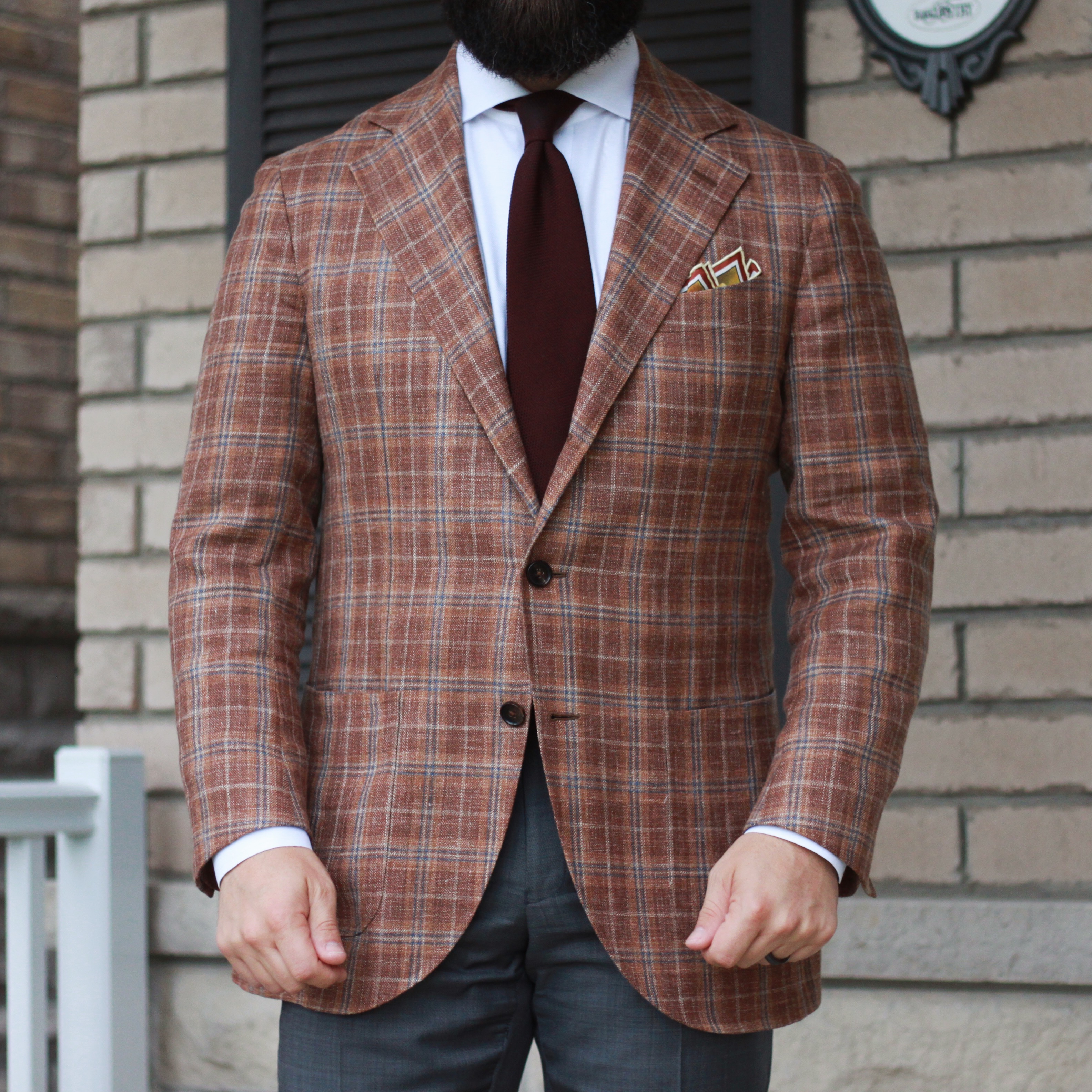
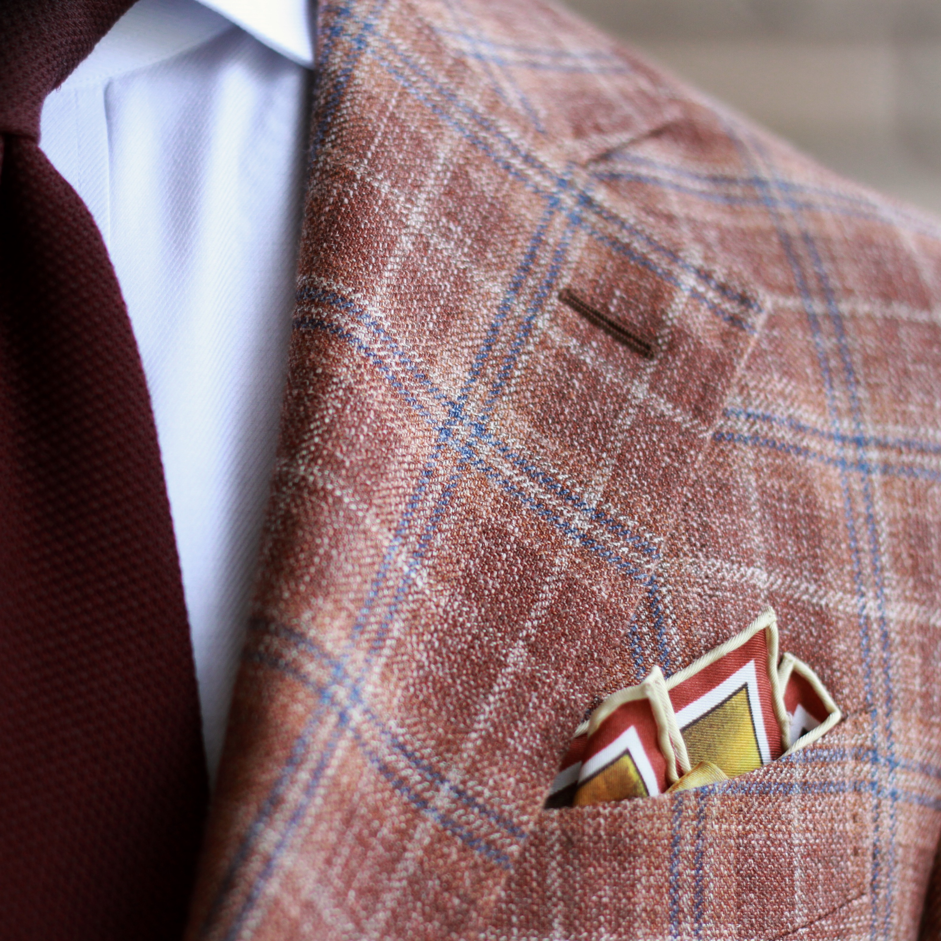
This fabric from E. Thomas has a wonderfully soft texture. I like the bold pattern, as it is softened by the variations the interweaving of the lighter threads. When I started to put this outfit together, I wasn’t sure if the colours in the pocket square and tie would work or clash. In the end, I feel that it did work, though I wouldn’t define the colours as complimentary. Rather, I’d define what I wore as a bit of measured discord. The burgundy grenadine from Sam Hober balances against the sport coat with a more saturated colour and refined texture. The pocket square is a new one from Rampley & Co, “The Fall of Phaeton“. Both have colours in the red family that are somewhat dissimilar to the rusty, brick red of the sport coat. Keeping a balanced overall look is accomplished with the choice of mid-grey trousers.
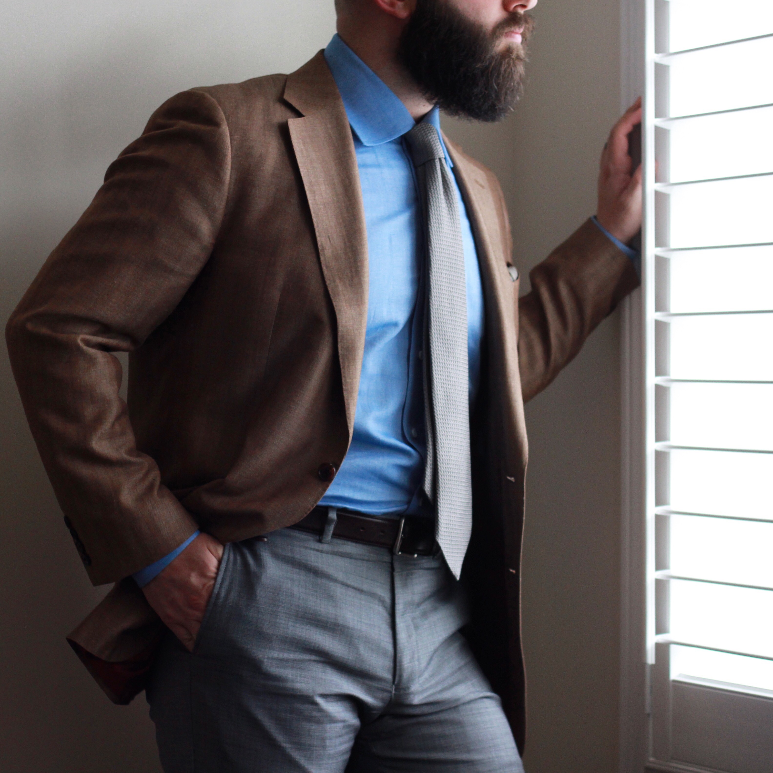
What I Wore - Brown and Grey
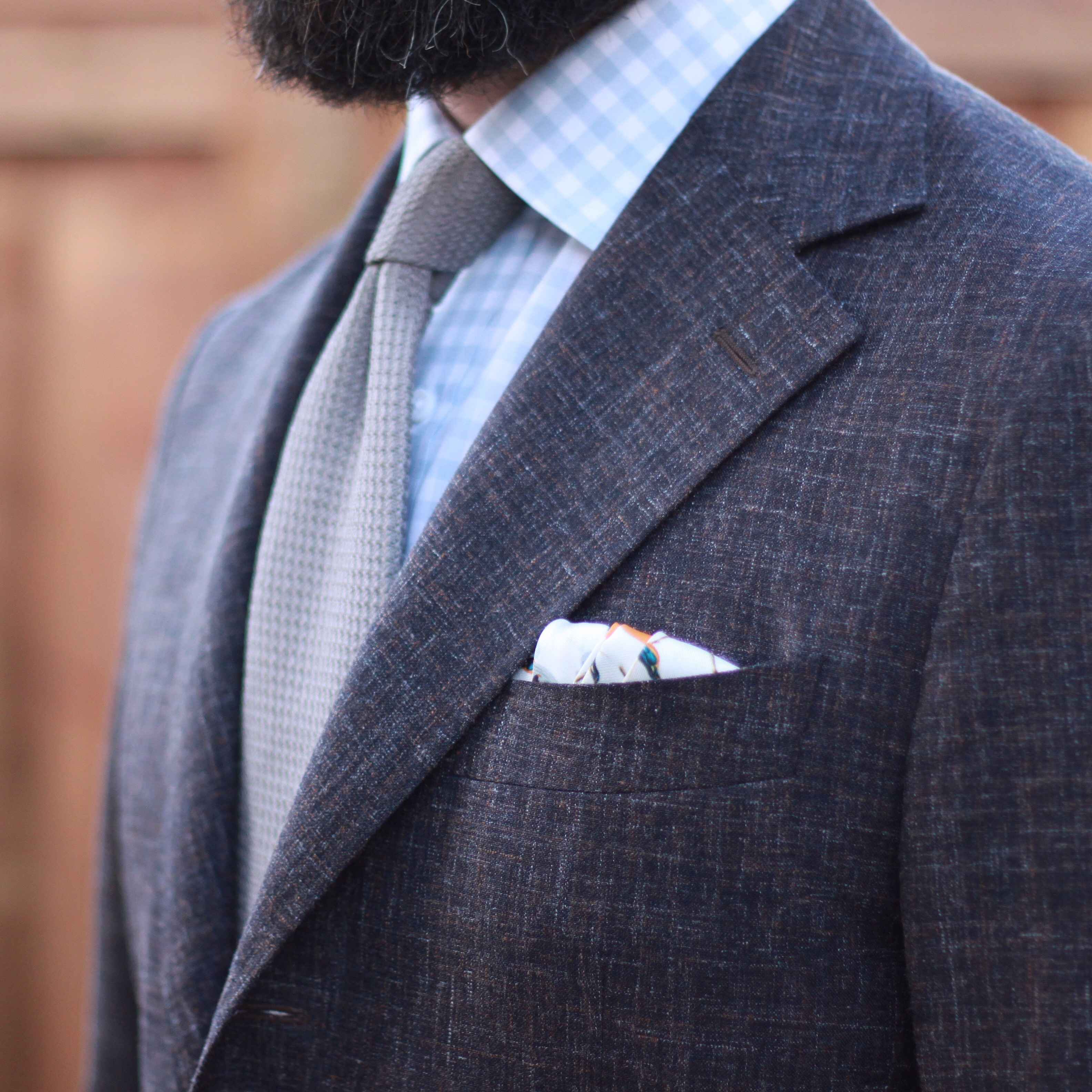
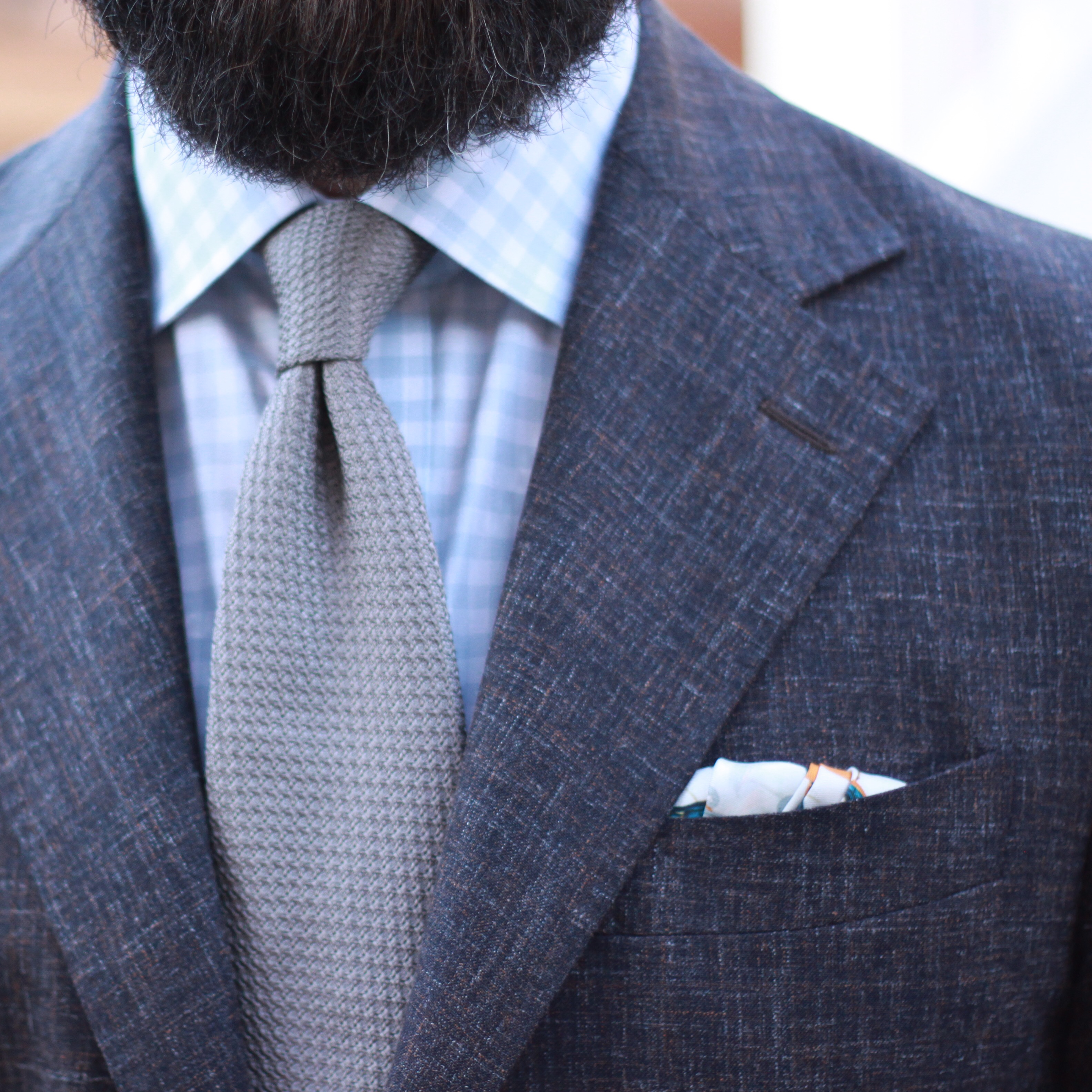
In a rare instance, this outfit was actually built around the pocket square. Another new arrival from Rampley & Co, this is their “Kingfisher” square. I am drawn to it because of the white background featuring turquoise, blue and orange. Next, I chose the shirt. This is the soft mint from Spier & Mackay that I had made up with a semi-spread collar. It’s the only gingham patterned shirt I have, and it has proven to be a great option – not saturated or overly casual. The colour lies somewhere closer to a blue/teal than a minty green. My thinking was that the more saturated colours in the square could help guide the colour the shirt presents. I chose the jacket next, and keeping the square in mind, went with this brown one. It’s a wonderfully textured piece, with bits of grey and copper threads throughout. I hoped the copper threads would pick up the orange highlights in the Kingfisher square. To my eye, that was successful. Lastly, I went with light grey – the grenadine tie from Kent Wang, and the unseen trousers below.
What I Wore - a taste of Fall

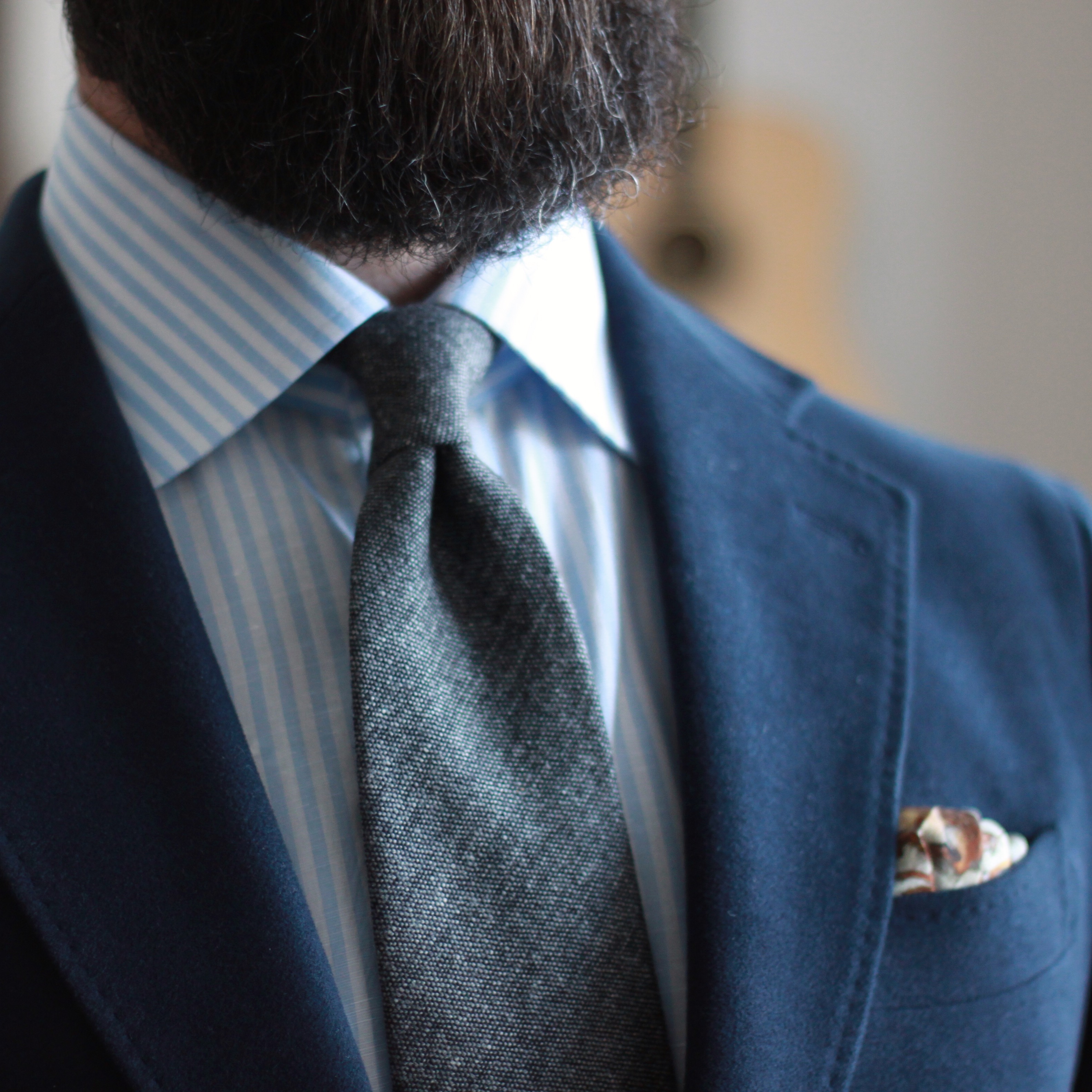
The first truly cold day of September was a great excuse to pull out my moleskin jacket. It was also a great time to take a couple of new Kent Wang accessories for their first wear. The grey Donegal tie was a nice addition. I have a few grey ties, but they all skew light. This one also has wonderful texture and visual interest. The pocket square is the Lod Mosaic in silk. A muted palette of greys and browns, it will be a very versatile piece. Mid-grey trousers balance out the contrast, and the light blue oban stripe shirt is a nice intermediary pattern between the tweed tie and rich softness of the moleskin.
What I Wore - saturated blues
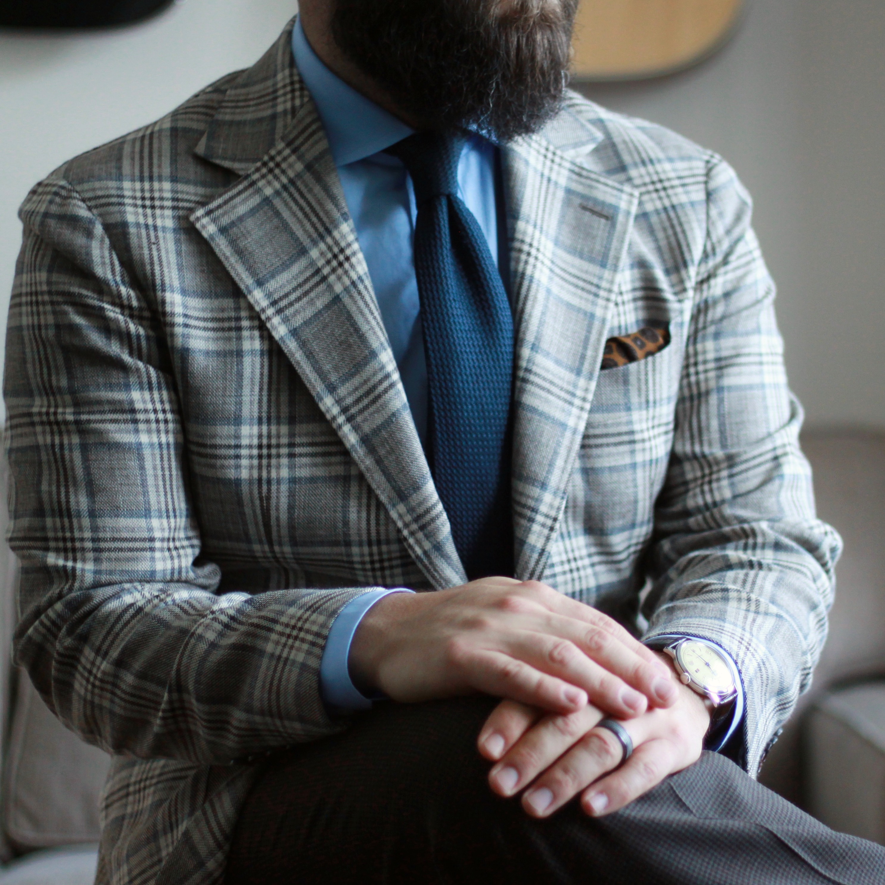
This final outfit worked well. Somehow, I hadn’t yet paired this jacket with a blue tie. So when I reached for my navy grenadine from Kent Wang, I decided to go with a saturated french blue poplin shirt. This really accentuates the steely blue check in the jacket’s fabric. Picking up the brown check with these dark brown trousers seemed to be a tonally appropriate choice. The pocket square is the weak link to me here. It is a warm, almost orange-y brown base, and it feels a bit out of place in the relatively cool palette of the rest of the pieces. I do like this SuitSupply square, it just wasn’t the best choice.
What I Wore - September
So as I mentioned, October will be full of flannels, tweeds and layers. I’m ready for it. Are you?
-Colin
